
SUS — 设计令牌(Design Tokens):字体、颜色、图标、主题
全新 SUS 的设计令牌(design token)架构。
SUS 中主题、字体与图标的唯一真源(StyleSheet 级联 + Resources)。 原则: 一切都通过 CSS 级联与var()完成——组件不知道具体数值,只知道语义化的令牌。
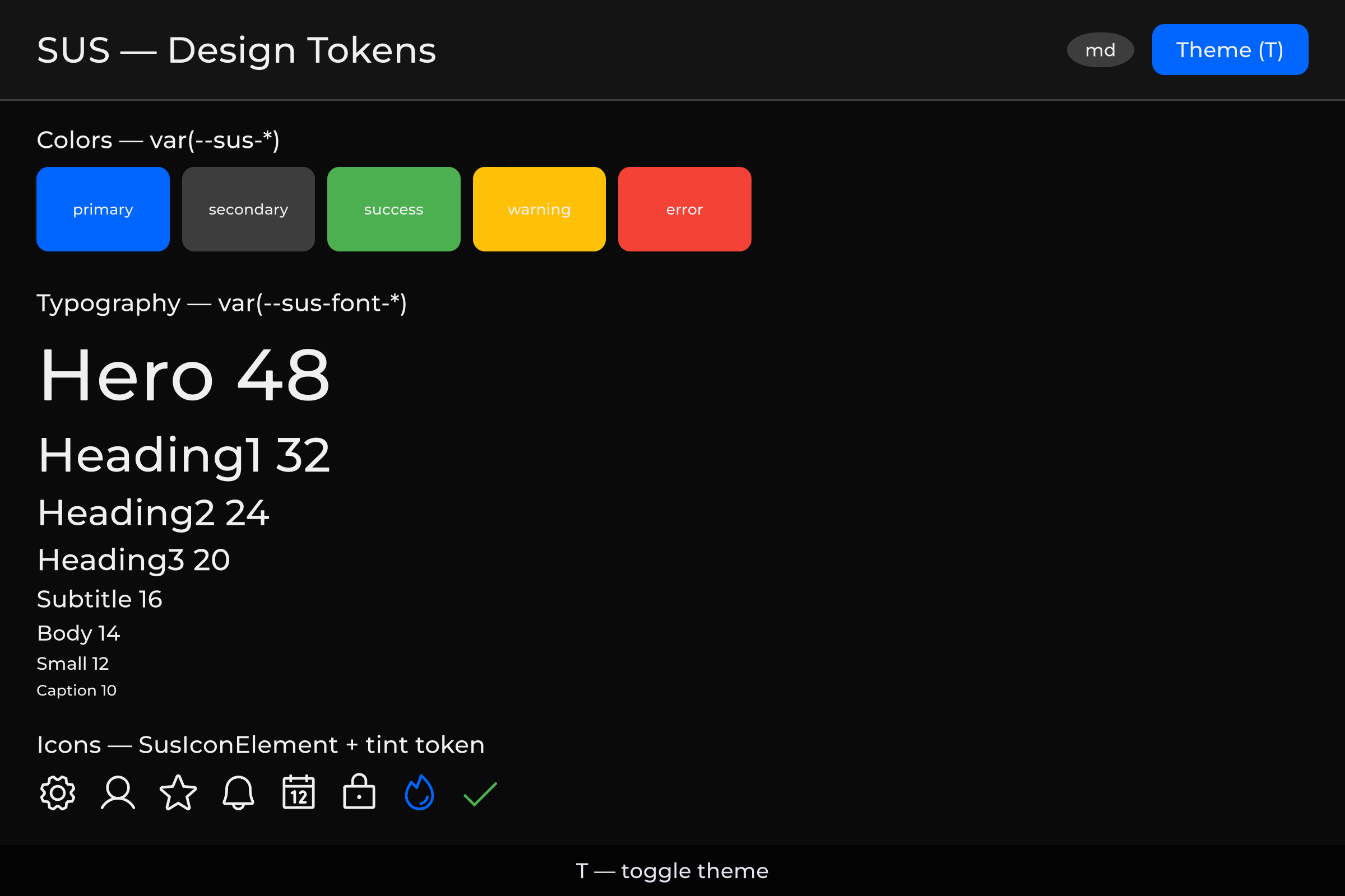 颜色、排版与图标 — 深色 | 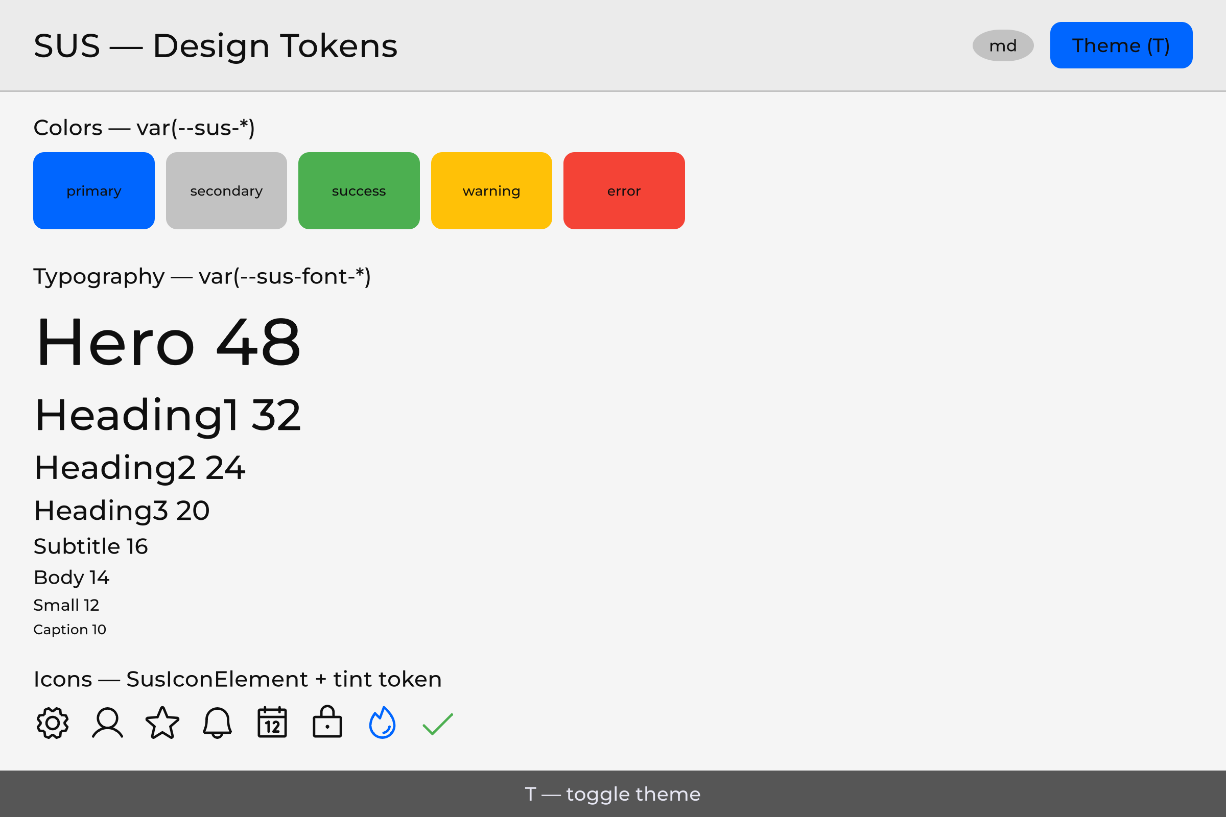 相同令牌 — 浅色 |
目录
- 总体架构(含 无需编辑 C# 即可重设样式)
- 字体
- 颜色:三层令牌体系
- 图标:Phosphor Icons
- 主题:切换 Light/Dark
- 响应式断点
- Bootstrap:整体是如何组装起来的
- 文件结构
- 历史检查表
- 附录 A:令牌汇总表
- 附录 B:过程中识别出的关键规则与模式
1. 总体架构
1.1 原则
The component writes: And receives:
  color: var(--sus-text-primary) → rgba(255,255,255,1) (in dark theme)
  font-size: var(--sus-font-size-body) → 14px (semantic size from _font.uss)
  -unity-font: var(--sus-font-body) → Montserrat (family bridge)
令牌通过 CSS 级联来解析。变量定义在 :root USS 文件中,这些文件通过直接调用 root.styleSheets.Add() 接入。
1.2 三层令牌
LAYER 1 — Raw values (ground truth)
  _palette.uss                     — --base-color-*, --base-space-*, --base-font-*, --base-radius-*
  _font.uss                        — --font-family-*, --font-heading, --font-body

LAYER 2 — Theme aliases (light/dark switch)
  _theme.uss (:root + .theme-dark)  — --thm-* (dark default)
  _theme.uss (.theme-light)         — --thm-* (light override)

LAYER 3 — Semantic UI tokens
  design-tokens.uss                 — --sus-* (delegates to --thm-*)
_icon.uss — .sus-icon-bg utility class加载顺序(通过 SusBootstrap.LoadTokenCascade / SusApp 的容器级联): _palette → _font → _theme → design-tokens → _icon → 已注册的扩展(L4/L5)→ OverlayHost。
面板级 TSS(SusDefault.tss / ApplyDefaultTSS)也包含 _palette、_font,以及可选的 _global——_global 不属于容器级联的一部分。
主题通过在级联根节点上添加/移除 .theme-dark / .theme-light (SusThemeService.Instance.SetTheme(root, theme))来切换。
1.3 在旧方案中是如何工作的
SusDataManager.LoadUIResolutionThemes()(遗留代码)会创建多套主题预设。 在 SUS 中这被简化了——仅通过 .theme-* 类实现 Dark/Light;屏幕尺寸适配 仅通过断点(SusBreakpointService + .breakpoint-* 令牌覆盖)。参见 06-responsive.md。
1.4 无需编辑 C# 即可重设样式
令牌级联不只是内部卫生规则——它是受支持的做法,让 控件看起来像你的游戏,而无需编辑 C#:
- 令牌(
--sus-*) — 在级联根上覆盖语义化令牌(或它们所委托的 L1/L2 值)。 所有使用这些令牌的消费者会一起重新着色:改一张样式表,整个 UI 随之变化。 - 类 — 为组件或元素类添加项目 USS 规则,实现一次性外观 (按钮、面板、行),而无需 fork 组件脚本。
- 状态即类 — hover / active / disabled / selected(及类似状态)由 USS 类或 UITK 伪类驱动。C# 只切换成员资格 (
AddToClassList/RemoveFromClassList或 Sharq 等价物)。重设状态样式与 重设基础样式是同一件事:改样式表,不改脚本。
策略 vs 技术债。 买家需要能够覆盖的 look-and-feel 应放在 USS 中。必须跟随 runtime props 的几何与 motion 可以留在 C#。来自 C# 的 UITK 内联外观写入 (.style.backgroundColor、.style.color、字体、radii 等)会压过任何选择器—— 这些 call site 的已知残留仍然存在,并正在迁移到 USS/类。不要把这些 call site 当作主题化 API;优先使用令牌与类。具名例外 (motion tweens、font service、drag ghosts 及类似情况)是有意为之,并在代码中有文档说明。
2. 字体
2.1 当前状态
已完成: Montserrat(6 种字重)随 sus-core 一同提供:
sus-core/Runtime/Resources/SusRuntime/
├── _font.uss
└── Fonts/Montserrat/
    ├── Montserrat-Regular.ttf    (400)
    ├── Montserrat-Medium.ttf     (500)
    ├── Montserrat-Bold.ttf       (700)
    ├── Montserrat-Black.ttf      (900)
    ├── Montserrat-Italic.ttf
    └── Montserrat-Light.ttf      (300)
_font.uss 定义了 :root { -unity-font: url("Fonts/Montserrat/Montserrat-Regular.ttf"); },以及 CSS 变量 --font-family-regular、--font-family-medium、--font-family-bold、--font-family-black、--font-family-italic、--font-family-light。
SusBootstrap.Mount<T>() 在每次挂载时都会自动加载 Resources/SusRuntime/_font.uss。
2.2 语义化字体(已提供)
_font.uss 定义了:
- 字体族插槽(Family slots)
--font-family-*(默认 Montserrat)。可选的项目级覆盖使用_font.uss文件头部文档中记录的回退模式(var(…, url(...)))——这些覆盖插槽不属于已发布的 61 个 L3 令牌清单的一部分。 - 语义化尺寸(L3)——组件使用这些(而不是原始的
--base-font-N,也不是--sus-前缀下的数值 px 别名):
--sus-font-size-caption   /* ← --base-font-size-xs (10px) */
--sus-font-size-small     /* 12px */
--sus-font-size-body      /* 14px */
--sus-font-size-subtitle  /* 16px */
--sus-font-size-heading3  /* 20px */
--sus-font-size-heading2  /* 24px */
--sus-font-size-heading1  /* 32px */
--sus-font-size-hero      /* 48px */
design-tokens.uss 还为 -unity-font 暴露了字体族桥接(family bridges):
--sus-font-body · --sus-font-label · --sus-font-heading · --sus-font-italic
2.2.1 原始 L1 字体尺寸(调色板)
_palette.uss 中仍保留原始的 --base-font-10 … --base-font-32。请把它们当作调色板内部实现。组件和买家示例必须使用上面这八个 --sus-font-size-caption … --sus-font-size-hero 令牌。
2.2.2 用户覆盖
创建 Assets/Resources/SusRuntime/_font.uss——Resources.Load 会优先使用项目中的副本。无需编写代码。尚未提供的字重(Thin / ExtraLight / …)记录在内部路线图中,不属于本包的内容。
3. 颜色:三层令牌体系
3.1 第 1 层——原始数值(位于 _palette.uss)
这是随 sus-core 一同提供、位于 Resources/ 下的文件。不带语义的基础颜色:
/* sus-core/Runtime/Resources/SusRuntime/_palette.uss — Layer 1 */
:root {
    /* Greys */
    --base-color-Grey98:    rgb(250, 250, 250);
    --base-color-Grey94:    rgb(240, 240, 240);
    --base-color-Grey90:    rgb(229, 229, 229);
    --base-color-Grey80:    rgb(204, 204, 204);
    --base-color-Grey60:    rgb(153, 153, 153);
    --base-color-Grey40:    rgb(102, 102, 102);
    --base-color-Grey30:    rgb( 77,  77,  77);
    --base-color-Grey24:    rgb( 61,  61,  61);
    --base-color-Grey16:    rgb( 41,  41,  41);
    --base-color-Grey12:    rgb( 31,  31,  31);
    --base-color-Grey08:    rgb( 20,  20,  20);
    --base-color-Grey04:    rgb( 10,  10,  10);
    --base-color-Grey02:    rgb(  5,   5,   5);

    /* Primary (Blue) */
    --base-color-Primary90: rgb(205, 225, 255);
    --base-color-Primary70: rgb(102, 163, 255);
    --base-color-Primary50: rgb(  0, 102, 255);
    --base-color-Primary30: rgb(  0,  61, 153);
    --base-color-Primary10: rgb(  0,  20,  51);

    /* Accent / Success / Warning / Error */
    --base-color-Success:   rgb( 76, 175,  80);
    --base-color-Warning:   rgb(255, 193,   7);
    --base-color-Error:     rgb(244,  67,  54);
}
3.2 第 2 层——主题别名(_theme.uss 中的 Dark/Light)
L2 只定义 --thm-*(不存在臆造出来的 --thm-bg / --thm-fail / --thm-text-inverse)。完整列表位于该 USS 文件中;下面列出的关键分组与源文件保持一致。
Dark 主题(默认):
/* sus-core/Runtime/Resources/SusRuntime/_theme.uss — Layer 2 Dark (excerpt) */
:root,
.theme-dark {
    /* Surface */
    --thm-bg-page:            var(--base-color-Grey04);
    --thm-bg-surface:         var(--base-color-Grey08);
    --thm-bg-surface-raised:  var(--base-color-Grey12);
    --thm-bg-surface-overlay: var(--base-color-Grey16);
    --thm-bg-surface-variant: var(--base-color-Grey18);
    --thm-bg-disabled:        var(--base-color-Grey40);

    /* Text */
    --thm-text-primary:       var(--base-color-Grey94);
    --thm-text-secondary:     var(--base-color-Grey80);
    --thm-text-disabled:      var(--base-color-Grey60);
    --thm-text-on-primary:    var(--base-color-Grey98);

    /* Border */
    --thm-border:             var(--base-color-Grey24);
    --thm-border-hover:       var(--base-color-Grey40);
    --thm-border-focus:       var(--base-color-Primary50);

    /* Brand / status */
    --thm-primary:            var(--base-color-Primary50);
    --thm-primary-hover:      var(--base-color-Primary70);
    --thm-primary-pressed:    var(--base-color-Primary30);
    --thm-secondary:          var(--base-color-Grey24);
    --thm-secondary-hover:    var(--base-color-Grey30);
    --thm-success:            var(--base-color-Success);
    --thm-success-hover:      var(--base-color-SuccessHover);
    --thm-warning:            var(--base-color-Warning);
    --thm-warning-hover:      var(--base-color-WarningHover);
    --thm-error:              var(--base-color-Error);
    --thm-error-hover:        var(--base-color-ErrorHover);
    --thm-info:               var(--base-color-Info50);
    --thm-info-hover:         var(--base-color-Info70);

    /* Scrim / overlays */
    --thm-scrim:              var(--base-color-BlackT30);
    --thm-hover-overlay:      var(--base-color-WhiteT5);
    --thm-selected-overlay:   var(--base-color-WhiteT10);
    --thm-disabled-overlay:   var(--base-color-WhiteT5);
}
Light 主题(.theme-light——可反转的部分会翻转灰阶;品牌色/状态色大多沿用相同的 --base-*):
/* sus-core/Runtime/Resources/SusRuntime/_theme.uss — Layer 2 Light (excerpt) */
.theme-light {
    --thm-bg-page:            var(--base-color-Grey96);
    --thm-bg-surface:         var(--base-color-Grey92);
    --thm-bg-surface-raised:  var(--base-color-Grey88);
    --thm-bg-surface-overlay: var(--base-color-Grey84);
    --thm-bg-surface-variant: var(--base-color-Grey81);
    --thm-bg-disabled:        var(--base-color-Grey60);

    --thm-text-primary:       var(--base-color-Grey06);
    --thm-text-secondary:     var(--base-color-Grey20);
    --thm-text-disabled:      var(--base-color-Grey40);
    --thm-text-on-primary:    var(--base-color-Grey98);

    --thm-border:             var(--base-color-Grey76);
    --thm-border-hover:       var(--base-color-Grey60);
    --thm-border-focus:       var(--base-color-Primary50);

    --thm-secondary:          var(--base-color-Grey76);
    --thm-secondary-hover:    var(--base-color-Grey70);
    --thm-hover-overlay:      var(--base-color-BlackT10);
    --thm-selected-overlay:   var(--base-color-BlackT18);
    --thm-disabled-overlay:   var(--base-color-BlackT10);
    --thm-scrim:              var(--base-color-BlackT30);
    /* primary / success / warning / error / info — same --base-* as dark */
}
完整的代码块请参见 _theme.uss(包括游戏专用的 --thm-rare / --thm-heal / … ——仅存在于 L2,不会映射为 --sus-*)。
3.3 第 3 层——语义化 UI 令牌(design-tokens.uss + 字体尺寸)
公开的 L3 API:共 61 个 --sus-* 定义——design-tokens.uss 中 53 个,加上 _font.uss 中 8 个语义化字号令牌。请直接从这些文件中取用;不要臆造组件级的颜色别名(按钮、输入框、tooltip、滚动条)——而是组合使用 L3。
/* sus-core/Runtime/Resources/SusRuntime/design-tokens.uss — Layer 3 (as-is) */
:root {
    /* ── Surface ── */
    --sus-bg-page:            var(--thm-bg-page);
    --sus-bg-surface:         var(--thm-bg-surface);
    --sus-bg-surface-raised:  var(--thm-bg-surface-raised);
    --sus-bg-overlay:         var(--thm-bg-surface-overlay);

    /* ── Text ── */
    --sus-text-primary:       var(--thm-text-primary);
    --sus-text-secondary:     var(--thm-text-secondary);
    --sus-text-disabled:      var(--thm-text-disabled);
    --sus-text-on-primary:    var(--thm-text-on-primary);

    /* ── Border ── */
    --sus-border:             var(--thm-border);
    --sus-border-hover:       var(--thm-border-hover);
    --sus-border-focus:       var(--thm-border-focus);
    --sus-divider:            var(--thm-border);

    /* ── Scrim ── */
    --sus-scrim:              var(--thm-scrim);

    /* ── Surfaces ── */
    --sus-bg-surface-variant: var(--thm-bg-surface-variant);
    --sus-bg-disabled:        var(--thm-bg-disabled);

    /* ── Primary ── */
    --sus-primary:            var(--thm-primary);
    --sus-primary-hover:      var(--thm-primary-hover);
    --sus-primary-pressed:    var(--thm-primary-pressed);

    /* ── Secondary ── */
    --sus-secondary:          var(--thm-secondary);
    --sus-secondary-hover:    var(--thm-secondary-hover);

    /* ── Semantic colors ── */
    --sus-success:            var(--thm-success);
    --sus-success-hover:      var(--thm-success-hover);
    --sus-warning:            var(--thm-warning);
    --sus-warning-hover:      var(--thm-warning-hover);
    --sus-error:              var(--thm-error);
    --sus-error-hover:        var(--thm-error-hover);
    --sus-info:               var(--thm-info);
    --sus-info-hover:         var(--thm-info-hover);

    /* ── Overlay accents (hover/selected/disabled states) ── */
    --sus-hover-overlay:      var(--thm-hover-overlay);
    --sus-selected-overlay:   var(--thm-selected-overlay);
    --sus-disabled-overlay:   var(--thm-disabled-overlay);

    /* ── Opacity states ── */
    --sus-opacity-hover:      0.04;
    --sus-opacity-focus:      0.12;
    --sus-opacity-selected:   0.08;
    --sus-opacity-disabled:   0.38;

    /* ── Font family bridges (-unity-font) ── */
    --sus-font-body:         var(--base-font-body);
    --sus-font-label:        var(--base-font-label);
    --sus-font-heading:      var(--base-font-heading);
    --sus-font-italic:       var(--base-font-italic);

    /* ── Spacing ── */
    --sus-space-0:  0px;
    --sus-space-4:  var(--base-space-4);
    --sus-space-8:  var(--base-space-8);
    --sus-space-12: var(--base-space-12);
    --sus-space-16: var(--base-space-16);
    --sus-space-24: var(--base-space-24);
    --sus-space-32: var(--base-space-32);
    --sus-space-48: var(--base-space-48);
    --sus-space-64: var(--base-space-64);

    /* ── Radius ── */
    --sus-radius-sm:   var(--base-radius-sm);
    --sus-radius-md:   var(--base-radius-md);
    --sus-radius-lg:   var(--base-radius-lg);
    --sus-radius-xl:   var(--base-radius-xl);
    --sus-radius-full: var(--base-radius-full);
}
字号(Font sizes)(同样属于 L3;定义在 _font.uss 中,而不是 design-tokens.uss):
/* sus-core/Runtime/Resources/SusRuntime/_font.uss — semantic sizes */
:root {
    --sus-font-size-caption:  var(--base-font-size-xs);
    --sus-font-size-small:    var(--base-font-size-sm);
    --sus-font-size-body:     var(--base-font-size-md);
    --sus-font-size-subtitle: var(--base-font-size-lg);
    --sus-font-size-heading3: var(--base-font-size-xl);
    --sus-font-size-heading2: var(--base-font-size-2xl);
    --sus-font-size-heading1: var(--base-font-size-3xl);
    --sus-font-size-hero:     var(--base-font-size-4xl);
}
组合使用(不是 L3 令牌): 按钮/输入框/tooltip/滚动条都是通过组合上面这些令牌得到的——例如主按钮 background-color: var(--sus-primary);标签 color: var(--sus-text-on-primary);悬停态 var(--sus-primary-hover);模态框的半透明背景 var(--sus-scrim);悬浮面板表面 var(--sus-bg-overlay) 或 var(--sus-bg-surface-raised)。
间距刻度在布局中的用法: 同级元素之间的间距保持在 --sus-space-8 或更大,保持行对齐,避免内容被裁切,并且只使用令牌(不要使用原始像素值)。
3.4 在组件中使用
<!-- Card.sharq — compose L3 tokens (no component-level color aliases) -->
<style scoped>
.card {
    background-color: var(--sus-bg-surface);
    border-width: 1px;
    border-color: var(--sus-border);
    border-radius: var(--sus-radius-md);
    color: var(--sus-text-primary);
    padding: var(--sus-space-16);
}
.card__title {
    font-size: var(--sus-font-size-heading3);
    -unity-font: var(--sus-font-heading);
    color: var(--sus-text-primary);
}
.card__body {
    font-size: var(--sus-font-size-body);
    color: var(--sus-text-secondary);
    margin-top: var(--sus-space-8);
}
.card__cta {
    background-color: var(--sus-primary);
    color: var(--sus-text-on-primary);
}
.card__cta:hover {
    background-color: var(--sus-primary-hover);
}
.card__link {
    color: var(--sus-primary); /* links: brand color, not a separate link token */
}
</style>
4. 图标:Phosphor Icons
SUS 以 VectorImage SVG 的形式内置了 Phosphor Icons(MIT 协议)——而不是 Bootstrap Icons。 现在已经没有 Icons/bootstrap/ 目录树了。
| 分类 | 路径 | 数量 | 作用 |
|---|---|---|---|
| Core | Resources/SusRuntime/Icons/core/{regular,fill}/ | ~127 SVGs | 内置集合,始终存在:组件和下游 UI 包默认使用的全部图标 |
| Phosphor | Samples~/PhosphorIcons/Resources/SusRuntime/Icons/phosphor/{thin,light,regular,bold,fill,duotone}/ | 1512 个名称 × 6 种字重 ≈ 9000 个 SVG | 可选的完整图标库,作为 Phosphor Icon Set 示例导入 |
字重(Weights)(SusIconWeight):Thin、Light、Regular(默认)、Bold、Fill、Duotone。
状态: ✅ 运行时 + 编辑器都会自动注册这两个 provider;下游 UI 包使用同一个 registry。
完整图标集被有意放在包外部:Resources 文件夹会被打进每一次玩家构建、无法被裁剪,所以无论是否使用, 9000 个 SVG 都会让每个使用者多付出约 19 MB 的体积。PhosphorIconProvider 会从任意 Assets/**/Resources/SusRuntime/Icons/phosphor/ 文件夹中读取,因此无论是导入示例,还是只把你需要的 少数图标复制进自己的 Resources 文件夹,两种方式都可以。如果没有它,SusIconRegistry 会退回到核心 子集,对长尾图标返回 null,而不是直接失败。
4.1 磁盘上的目录结构
sus-core/Runtime/Resources/SusRuntime/Icons/
└── core/
    ├── regular/     star.svg, gear.svg, …
    └── fill/        star-fill.svg, …          (weight folder + optional -fill suffix)

sus-core/Samples~/PhosphorIcons/Resources/SusRuntime/Icons/    (optional sample)
└── phosphor/
    ├── thin/
    ├── light/
    ├── regular/     {name}.svg
    ├── bold/        {name}-bold.svg
    ├── fill/        {name}-fill.svg
└── duotone/ {name}-duotone.svg加载约定(ResourcesFolderIconProvider):资源路径为SusRuntime/Icons/{collection}/{weightFolder}/{fileName}
其中 fileName 在 regular 时是 {name},其余情况是 {name}-{weight}。
两个构造函数:
new ResourcesFolderIconProvider("app")——项目本地重载(不带 package id)。可以从任意Assets/**/Resources/SusRuntime/Icons/app/…文件夹提供图标(包括向导生成的Customization/Icons/Resources/…)。用于你自己项目的图标。new ResourcesFolderIconProvider("com.my.game", "app")——打包重载。第一个参数是 UPM package id,其Runtime/Resources/SusRuntime/Icons/app/…中存放着图标(编辑器扫描 +.meta修复都会针对该包进行)。只有当你把图标打进自己的包里时才使用它。不要为你自己项目 的图标传入"com.sharq-it.sus.core"——那会把扫描指向 core 包。
4.2 图标查找是如何工作的
SusIcon / SusIconRegistry.Load(alias, weight)
  → resolve semantic aliases (e.g. "settings" → "gear")
  → optional name suffix "-fill" / "-bold" / … overrides weight
  → query ISusIconProvider list (first hit wins):
       1. Project providers (SusApp.UseIcons / RegisterProvider highest priority)
       2. CoreIconProvider          (Icons/core)
       3. PhosphorIconProvider      (any Assets/**/Resources/…/Icons/phosphor, auto via PhosphorIconBootstrap)
PhosphorIconBootstrap 会在 SubsystemRegistration / 编辑器加载时以 asHighestPriority: false 注册 Phosphor,因此对于重名的图标,core + 项目图标仍然拥有更高优先级。
4.3 API(当前)
// Weight enum — not the old SusIconStyle Outline/Filled
public enum SusIconWeight { Thin, Light, Regular, Bold, Fill, Duotone }

// Core primitive (also used under the hood)
var icon = new SusIcon("gear");                      // Regular
var star = new SusIcon("star", SusIconWeight.Fill);
icon.Name.Value = "x";                               // reactive

VectorImage img = SusIconRegistry.Load("star", SusIconWeight.Fill);
SusIconRegistry.AddAlias("settings", "gear");
SusIconRegistry.RegisterProvider(myProvider, asHighestPriority: true);

// SusApp — project icons win over Phosphor
SusApp.Create(uiDocument)
    .UseIcons(new ResourcesFolderIconProvider("com.my.game", "app"))
    .Mount<HomeScreen>();
下游 UI 包可能会暴露一个更高层的图标组件:
<sus:SusIcon Icon="star" Weight="Fill" Size="md" />Kind=phosphor|game|portrait|auto——game/portrait 使用消费端的媒体桥接;详见你所用的可选组件包文档。
4.4 SVG 导入设置(重要)
每个 .svg.meta 都应使用 UI Toolkit Vector Image + 抗锯齿细分(tessellation):
svgType: 3                          # UI Toolkit Vector Image
tessellationMode: 1                 # Antialiased Arc Encoding (NOT 0)
textureSize: 256
sampleCount: 4
如果不设置 tessellationMode: 1,曲线看起来会有锯齿。
4.5 辅助 USS
_icon.uss ——用于纯 VisualElement / 核心 SusIcon 的全局类(.sus-icon-bg):
.sus-icon-bg {
    background-size: contain;
    background-repeat: no-repeat;
    background-position: center;
    -unity-background-image-tint-color: rgb(255, 255, 255);
    flex-shrink: 0;
}随令牌级联一起加载(SusBootstrap / SusApp)。
4.6 图标:USS 还是 C#
| 内容 | 位置 | 原因 |
|---|---|---|
background-size/position/repeat、flex-shrink | USS(.sus-icon-bg / companion) | 静态 |
| 默认着色(tint) | USS | 主题可以覆盖 |
backgroundImage | C#,通过 SusIconRegistry.Load | 运行时资源 |
| 尺寸 / 字重 / 名称 | Props / C# | 动态 |
4.7 自定义 / 项目图标
不要把文件放进一个并不存在的 Icons/bootstrap/custom/。请优先使用:
ResourcesFolderIconProvider指向你自己在Resources/SusRuntime/Icons/{yourCollection}/{weight}/下的图标集合,然后
使用SusApp.UseIcons(...)或SusIconRegistry.RegisterProvider(...)。- 或者使用
SusIconSetAsset+SusApp.UseIcons(iconSet)。 - 语义化别名:
SusIconRegistry.AddAlias("my-settings", "gear")。
Setup Project 脚手架使用 Customization/Icons/.../app/ + ResourcesFolderIconProvider("app") (项目本地重载)作为项目覆盖层。
5. 主题:切换 Light/Dark
5.1 在旧方案中是如何工作的
UIResolutionThemes—— 一个持有 6 个StyleTheme数组的 ScriptableObject(Dark/Light/CustomLight × High/Low)panel.themeStyleSheet=ThemeStyleSheet(.tss),通过@import拉取整条 USS 链Update中的PollScreenWidth()——在跨越 1600px 时切换 High/LowSetStyleTheme()——切换 Dark/Light/CustomLight
5.2 SUS——当前 API
主题切换不再使用 ThemeStyleSheet——USS 样式表通过 LoadTokenCascade / SusApp 添加到容器中。 主题变体是级联根节点上的 CSS 类。
分层文件:
_palette.uss—— L1--base-*(原始数值)_theme.uss—— L2--thm-*,用于.theme-dark/.theme-light
运行时 API(SusTheme 是一个 readonly struct;服务是单例):
// sus-core/Runtime/SusTheme.cs + Runtime/Services/SusThemeService.cs
namespace Sharq.Core
{
    public readonly struct SusTheme
    {
        public string Name { get; }
        public SusTheme(string name);
        public static SusTheme Dark => new("dark");
        public static SusTheme Light => new("light");
        public string CssClass => $"theme-{Name}";  // "theme-dark", "theme-light", …
    }

    public class SusThemeService
    {
        public static SusThemeService Instance { get; }
        public static Prop<SusTheme> Current { get; }

        // Applies .theme-{name} on the cascade root + OverlayHost
        public void SetTheme(VisualElement root, SusTheme theme);
    }
}
用法:
SusThemeService.Instance.SetTheme(root, SusTheme.Dark);
SusThemeService.Instance.SetTheme(root, SusTheme.Light);
SusThemeService.Instance.SetTheme(root, new SusTheme("midnight"));  // custom → .theme-midnight

Watch(SusThemeService.Current, (_, next) => AdaptToTheme(next));
通过根节点上的类进行 CSS 切换——已经在 _theme.uss 中实现(参见 3.2)。
5.3 SusBootstrap / SusApp
SusApp.Create(...).UseTheme(...).Mount/Run 会最后应用主题,以便 OverlayHost 也能拿到主题类。请优先使用这条路径,而不是手动 styleSheets.Add。
SusBootstrap.Mount<T>() / LoadTokenCascade 会加载完整级联 (_palette → _font → _theme → design-tokens → _icon → 扩展 + OverlayHost)。
6. 响应式断点
屏幕尺寸适配只通过 SusBreakpointService 实现(级联根节点上的 .breakpoint-sm … .breakpoint-2xl 类)。不存在 High/Low 分辨率轴,也没有与显示器尺寸绑定的自动 UI 缩放。
宽度是在几何变化时从 cascadeRoot.resolvedStyle.width 读取的(与已移除的 SusResolutionService 相同的数据来源),只有在根节点尚未完成布局时才会回退到 panel / Screen。参见 06-responsive.md。
下游 UI 包的令牌表可以在这些类下覆盖包专属的令牌(高度、间距、字体)。已经在使用这些 变量的组件无需逐个组件编写 C# 代码,就能响应当前生效的断点。
示例 / 向导使用的 PanelSettings 采用 ConstantPixelSize,以便断点宽度与面板保持一致 (不使用 Unity 的 ScaleWithScreenSize 自动缩放)。
7. Bootstrap:整体是如何组装起来的
7.1 启动顺序(优先使用 SusApp)
SusApp.Create(uiDocument)
  ├─ ApplyDefaultTSS (panel: _palette + _font + _global via SusDefault.tss)
  ├─ EnsureEventSystem
  ├─ UseIcons → SusIconRegistry
  ├─ LoadTokenCascade (container):
  │     _palette → _font → _theme → design-tokens → _icon → extras
  │     + Breakpoint/Density/Scale services + OverlayHost
  ├─ EnsureWorldSpacePanel (if UseWorldSpace && playing)
  ├─ UseFonts / UseCustomStyles
  ├─ Configure callbacks (router / manual UI)
  ├─ Mount<T> (optional)
  └─ SusThemeService.Instance.SetTheme(root, theme)   ← last
重要: 容器级联始终包含 _palette 和 _theme(不只是 design-tokens)。请优先使用 SusApp,而不是手写 root.styleSheets.Add(...)。
World-space 面板的注意事项。
EnsureWorldSpacePanel会给 world 面板配备自己的一套令牌 级联(_palette → _font → _theme → design-tokens),但**UseFonts、UseCustomStyles(品牌化)和SetTheme只会应用到屏幕根节点 + OverlayHost**——不会应用到 world 面板。 所以 world UI(来自下游 UI 包的血条/姓名牌)会以默认的 Dark 主题、默认字体渲染,且没有 品牌化覆盖。如果你需要在 world UI 上使用品牌色 / 浅色主题 / 自定义字体,需要自行将它们应用到app.WorldPanel/WorldSpaceService.Default.WorldSpacePanel(例如SusThemeService.Instance.SetTheme(worldRoot, theme),并把你的品牌化 USS 加载进去)。
7.2 每一层分别定义了什么
_palette.uss     — L1: --base-color-*, --base-space-*, --base-font-*, --base-radius-*
_font.uss        — font families (--font-family-*) + optional family override slots + --sus-font-size-caption…hero
_theme.uss       — L2: --thm-* for .theme-dark / .theme-light
design-tokens.uss— L3: --sus-* semantic tokens (colors, space, radius, font family bridges)
_icon.uss        — .sus-icon-bg utility
7.3 最小示例
public class AppEntry : MonoBehaviour
{
    public UIDocument uiDocument;

    void Start()
    {
        SusApp.Create(uiDocument)
            .UseTheme(SusTheme.Dark)
            .Mount<App>();
        // Fonts, colors, icons, OverlayHost, theme — all wired.
    }
}
更底层的替代方案(手动级联):
void Start()
{
    SusBootstrap.ApplyDefaultTSS(uiDocument);
    var root = uiDocument.rootVisualElement;
    SusBootstrap.LoadTokenCascade(root);
    SusBootstrap.Mount<App>(root);
    SusThemeService.Instance.SetTheme(root, SusTheme.Dark);
}
8. 文件结构
8.1 在 sus-core 中(随包提供)
sus-core/
├── Docs/
│   └── DESIGN_TOKENS.md          ← this document
│
├── Runtime/
│   ├── Resources/SusRuntime/
│   │   ├── _palette.uss          ← L1 --base-*                  ✅
│   │   ├── _font.uss             ← Fonts (Montserrat)           ✅
│   │   ├── _theme.uss            ← L2 --thm-*                   ✅
│   │   ├── design-tokens.uss     ← L3 --sus-*                   ✅
│   │   ├── _icon.uss             ← .sus-icon-bg                 ✅
│   │   ├── Fonts/Montserrat/     ← 6 .ttf
│   │   └── Icons/
│   │       └── core/{regular,fill}/
│   │           (full phosphor/{thin,light,regular,bold,fill,duotone}/
│   │            ships as the optional Samples~/PhosphorIcons sample)
│   ├── SusTheme.cs / Services/SusThemeService.cs
│   ├── SusBreakpointService.cs
│   ├── SusIconRegistry.cs + icon providers
│   ├── SusIcon.cs
│   ├── SusApp.cs
│   └── SusBootstrap.cs
版本说明: 包版本记录在 package.json 中。sus-core 中每次 .cs 变更都要更新 package.json(pre-push 钩子会强制要求)。
8.2 在用户项目中(可选覆盖)
Assets/Resources/SusRuntime/
├── _font.uss      ← font override
├── _palette.uss   ← L1 palette override (optional)
├── _theme.uss     ← L2 theme override (optional)
└── Icons/
    └── {yourCollection}/{regular|fill|…}/  ← via ResourcesFolderIconProvider
或者使用 SusApp.UseIcons(...) / SusIconSetAsset——参见 §4.7。
8.3 SUS Theme Editor(编辑器工具)
一个用于可视化编辑 _palette.uss 的编辑器窗口,不必手写 rgb() 数值: 每个令牌(--base-color-*)对应一个颜色色块、一条带实时对比度的预览条,以及一个能从 源颜色生成 hover/pressed 变体的生成器。修改会保存回项目的 _palette.uss 覆盖文件。
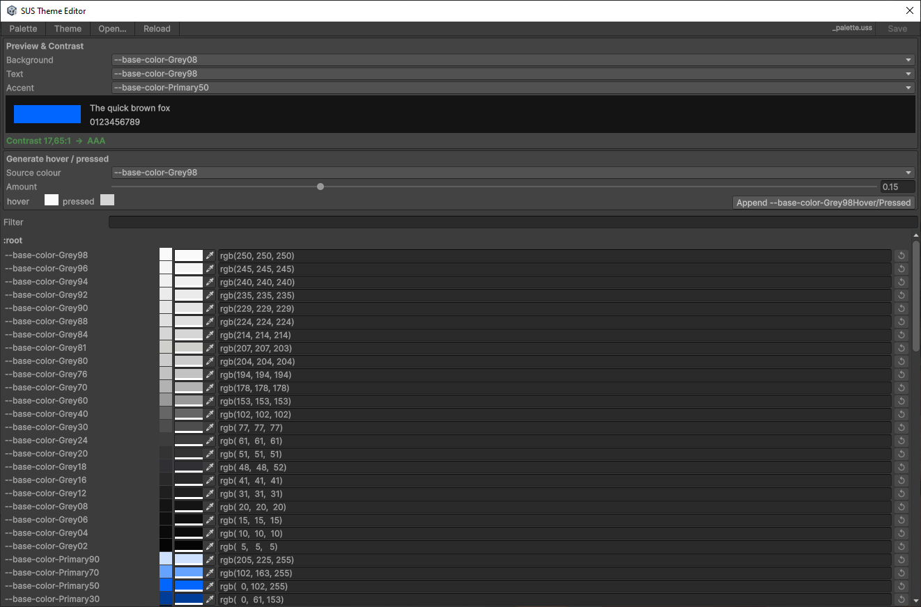
9. 历史检查表
阶段 B–F(调色板/主题/L3 令牌、断点、Phosphor 图标、SusApp 级联、文档)均已完成。这个面向买家的页面不是路线图。
尚未完成的字重工作(Thin / ExtraLight / SemiBold / ExtraBold 以及相关的 _font.uss 扩展)记录在内部路线图中,不属于本包的内容。
| 阶段 | 成果 | 状态 |
|---|---|---|
| A — 字体(已提供的子集) | Montserrat 6 种字重 + 语义化字号令牌 + 字体族桥接 | ✅(未提供的字重 → 内部计划) |
| B — 颜色 | _palette / _theme / design-tokens + SusThemeService | ✅ |
| C — 尺寸 / 断点 | 间距/圆角 L1;SusBreakpointService | ✅ |
| D — 图标 | 核心子集 + 可选的 Phosphor 示例 + registry | ✅ |
| E — Bootstrap | SusApp / LoadTokenCascade | ✅ |
| F — 文档 | 本页 + package 投影 | ✅ |
附录 A:令牌汇总表
公开的 L3 清单(61 个 --sus-*)。来源:design-tokens.uss + _font.uss(字号令牌)。
表面 / 文本 / 边框 / 遮罩(Scrim)
| Token | Role | Layer |
|---|---|---|
--sus-bg-page | 页面背景 | 颜色 L3 |
--sus-bg-surface | 卡片 / 面板 | 颜色 L3 |
--sus-bg-surface-raised | 悬浮表面 | 颜色 L3 |
--sus-bg-overlay | 遮罩层表面(--thm-bg-surface-overlay) | 颜色 L3 |
--sus-bg-surface-variant | 变体表面 | 颜色 L3 |
--sus-bg-disabled | 禁用态填充 | 颜色 L3 |
--sus-text-primary | 正文文本 | 颜色 L3 |
--sus-text-secondary | 次要文本 | 颜色 L3 |
--sus-text-disabled | 禁用态文本 | 颜色 L3 |
--sus-text-on-primary | 填充主色之上的文本 | 颜色 L3 |
--sus-border | 默认边框 | 颜色 L3 |
--sus-border-hover | 悬停边框 | 颜色 L3 |
--sus-border-focus | 焦点环 | 颜色 L3 |
--sus-divider | 分割线 | 颜色 L3 |
--sus-scrim | 模态框 / 遮罩层暗化 | 颜色 L3 |
品牌 / 状态 / 叠加层 / 透明度
| Token | Role | Layer |
|---|---|---|
--sus-primary, --sus-primary-hover, --sus-primary-pressed | 品牌色 | 颜色 L3 |
--sus-secondary, --sus-secondary-hover | 中性强调色 | 颜色 L3 |
--sus-success, --sus-success-hover | 成功 | 颜色 L3 |
--sus-warning, --sus-warning-hover | 警告 | 颜色 L3 |
--sus-error, --sus-error-hover | 错误 | 颜色 L3 |
--sus-info, --sus-info-hover | 信息 | 颜色 L3 |
--sus-hover-overlay | 悬停叠加 | 颜色 L3 |
--sus-selected-overlay | 选中叠加 | 颜色 L3 |
--sus-disabled-overlay | 禁用叠加 | 颜色 L3 |
--sus-opacity-hover, --sus-opacity-focus, --sus-opacity-selected, --sus-opacity-disabled | 数值型透明度 | 颜色 L3 |
字体
| Token | Role | Layer |
|---|---|---|
--sus-font-body, --sus-font-label, --sus-font-heading, --sus-font-italic | 字体族桥接(-unity-font) | 字体 L3 |
--sus-font-size-caption | 10px | 尺寸 L3 |
--sus-font-size-small | 12px | 尺寸 L3 |
--sus-font-size-body | 14px | 尺寸 L3 |
--sus-font-size-subtitle | 16px | 尺寸 L3 |
--sus-font-size-heading3 | 20px | 尺寸 L3 |
--sus-font-size-heading2 | 24px | 尺寸 L3 |
--sus-font-size-heading1 | 32px | 尺寸 L3 |
--sus-font-size-hero | 48px | 尺寸 L3 |
间距 / 圆角
| Token | Role | Layer |
|---|---|---|
--sus-space-0 … --sus-space-64 (0,4,8,12,16,24,32,48,64) | 间距刻度 | 尺寸 L3 |
--sus-radius-sm … --sus-radius-full (sm,md,lg,xl,full) | 圆角 | 尺寸 L3 |
经常与 L3 搭配使用的 L1 辅助令牌(不计入这 61 个):--font-family-regular、--main-font-family、--base-space-*、--base-radius-*。
附录 B:过程中识别出的关键规则与模式
B.1 静态写在 USS,动态写在 C#
┌─────────────┬────────────────────────┬──────────────────────────┐
│ Where │ Examples │ Rule │
├─────────────┼────────────────────────┼──────────────────────────┤
│ USS (static)│ background-size, │ Do not change in runtime │
│ │ flex-shrink, │ from props - write in USS │
│             │ margin-left, color,    │                          │
│             │ font-size (layout)     │                          │
├─────────────┼────────────────────────┼──────────────────────────┤
│ C# (dynamics) │ width/height from Size, │ Change from props or │
│ │ tint from TintColor, │ runtime logic - in code │
│             │ backgroundImage        │                          │
│             │ (Resources.Load)       │                          │
└─────────────┴────────────────────────┴──────────────────────────┘
动机: 变化的主要来源是 props。通过改变 props,我们只会修改 C# 中的动态属性。静态部分留在 USS 里,不会散落在代码各处。这样更便于阅读和调试。
示例(推荐):
// C# - only dynamic from props
el.style.width = size;                     // ← from prop Size
el.style.height = size;
el.AddToClassList("icon-row");             // ← statics in USS

/* USS:
.icon-row { flex-direction: row; align-items: center; margin-bottom: 6px; } */
示例(不推荐——反模式):
el.style.flexDirection = FlexDirection.Row;   // ← static in C# (migrate to USS)
el.style.alignItems = Align.Center;
el.style.color = new StyleColor(Color.white);
B.2 Sharq 裸 <style>——选择器是如何工作的
Source (.sharq) Compiled (.uss) Does root match?
─────────────────────────────────────────────────────────────────────
<style> .sus-icon { ✅ YES
    flex-shrink: 0;            flex-shrink: 0;
</style>                   }

<style> .sus-icon .sus-icon { ❌ NO
.sus-icon { flex-shrink: 0;            (.sus-icon inside .sus-icon)
    flex-shrink: 0;        }
}
</style>

<style> .sus-icon .child { ✅ YES (if child is inside)
.child {                        ...                    }
    ...
}
</style>
规则: 如果你需要为组件的根节点设置样式,直接把属性写在 <style> 中,不加选择器。如果 需要为子元素设置样式,使用它们的类名(不带组件前缀)。
在特殊情况下(self-target、container-target——参见规则 sharq-css-scoping.mdc)——把该规则 移到配套的 .uss 中,作为非 scoped 规则。
B.3 backgroundImage 重新赋值模式
UI Toolkit 已知问题:VectorImage 有时不会在第一帧渲染出来。经过验证的模式(来自旧版 SizedIcon):
el.style.backgroundImage = new StyleBackground(vec);
el.MarkDirtyRepaint();
el.schedule.Execute(() =>
{
    el.style.backgroundImage = new StyleBackground(vec);
    el.MarkDirtyRepaint();
}).ExecuteLater(0);
el.schedule.Execute(() =>
{
    el.style.backgroundImage = new StyleBackground(vec);
    el.MarkDirtyRepaint();
}).ExecuteLater(16);  // next frame
把 backgroundImage 重新赋值三次:立即一次、0 帧之后一次、约 1 帧之后一次。这样可以确保 VectorImage 不会在树重建时被“丢失”。
B.4 SVG 导入:tessellationMode
| Parameter | Meaning | Why |
|---|---|---|
svgType | 3 | UI Toolkit Vector Image(不是 Texture2D) |
tessellationMode | 1 | 抗锯齿 Arc Encoding——弧线边缘平滑 |
textureSize | 256 | 对于最大 48px 的图标已经足够 |
sampleCount | 4 | 用于亚像素抗锯齿的多重采样 |
永远不要使用 tessellationMode: 0(Basic Triangulation)——会让 SVG 曲线的边缘出现 像素化 / 锯齿。
B.5 USS 加载:优先使用 SusApp / LoadTokenCascade
// ✅ Correct: SusApp (or LoadTokenCascade) on the document root
SusApp.Create(uiDocument)
    .UseTheme(SusTheme.Dark)
    .Mount<App>();
// Cascade order: _palette → _font → _theme → design-tokens → _icon → extras + OverlayHost
// Panel TSS (_global) via ApplyDefaultTSS / SusDefault.tss

// ✅ Lower-level
SusBootstrap.ApplyDefaultTSS(uiDocument);
SusBootstrap.LoadTokenCascade(uiDocument.rootVisualElement);

// ❌ Incorrect: hand-add only design-tokens without _palette/_theme
root.styleSheets.Add(designTokensSheet);
B.6 sus-core 的版本管理
对 sus-core 中 .cs 的任何改动:
- 递增
sus-core/package.json中的版本号(patch 版本) - 提交时带上版本标签
- 推送 → 缓存进 Unity Package Manager
- 在客户端清除
Library/PackageCache/com.sharq-it.sus.core/ - 删除
Packages/packages-lock.json - 刷新 Unity → 包会被重新解析
脚本文件(.uss、.svg、.meta)的改动不需要手动清缓存。