
SUS — Design Tokens: fonts, colors, icons, themes
Design token architecture for the new SUS.
Source of truth for themes, fonts and icons in SUS (StyleSheet cascade + Resources). Principle: everything is done through a CSS cascade andvar()— the component does not know specific values, only semantic tokens.
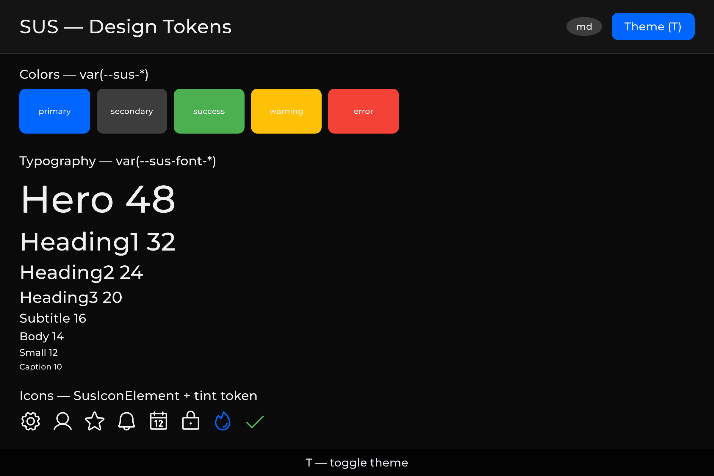 Colors, typography and icons — Dark | 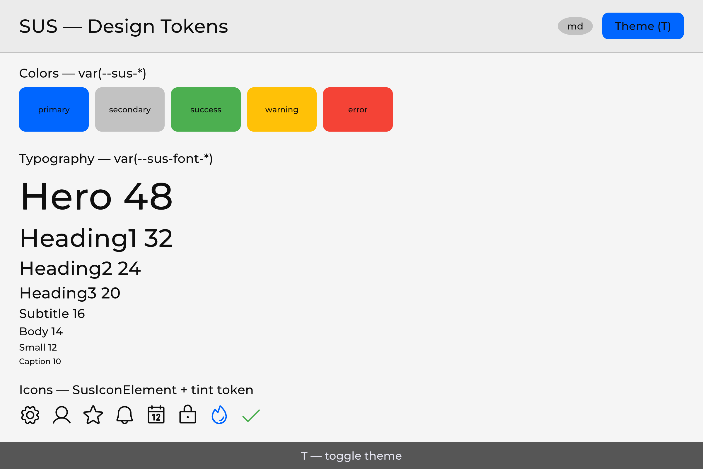 Same tokens — Light |
Content
- General architecture (incl. restyle without C#)
- Fonts
- Colors: three-layer token system
- Icons: Phosphor Icons
- Themes: switching Light/Dark
- Responsive breakpoints (incl. sizing token families)
- Bootstrap: how everything is put together
- File structure
- Historical checklist
- Appendix A: token summary table
- Appendix B: key rules and patterns
1. General architecture
1.1 Principle
The component writes: And receives:
  color: var(--sus-text-primary) → rgba(255,255,255,1) (in dark theme)
  font-size: var(--sus-font-size-body) → 14px (semantic size from _font.uss)
  -unity-font: var(--sus-font-body) → Montserrat (family bridge)
Tokens are resolved through a CSS cascade. Variables are defined in :root USS files that connect via direct root.styleSheets.Add().
1.2 Three layers of tokens
LAYER 1 — Raw values (ground truth)
  _palette.uss                     — --base-color-*, --base-space-*, --base-font-*, --base-radius-*
  _font.uss                        — --font-family-*, --font-heading, --font-body

LAYER 2 — Theme aliases (light/dark switch)
  _theme.uss (:root + .theme-dark)  — --thm-* (dark default)
  _theme.uss (.theme-light)         — --thm-* (light override)

LAYER 3 — Semantic UI tokens
  design-tokens.uss                 — --sus-* (delegates to --thm-*)
  _icon.uss                         — .sus-icon-bg utility class
Load order (container cascade via SusBootstrap.LoadTokenCascade / SusApp): _palette → _font → _theme → design-tokens → _icon → registered extras (L4/L5) → OverlayHost.
Panel-level TSS (SusDefault.tss / ApplyDefaultTSS) also includes _palette, _font, and optional _global — _global is not part of the container cascade.
Theme is switched by adding/removing .theme-dark / .theme-light on the cascade root (SusThemeService.Instance.SetTheme(root, theme)).
1.3 How it works in the old scheme
SusDataManager.LoadUIResolutionThemes() (legacy) created multiple theme presets. In SUS this is simplified — Dark/Light only via .theme-* classes; screen-size adaptation is breakpoints only (SusBreakpointService + .breakpoint-* token overrides). See 06-responsive.md.
1.4 Restyle without editing C#
The token cascade is not only an internal hygiene rule — it is the supported way to make controls look like your game without editing C#:
- Tokens (
--sus-*) — override semantic tokens (or the L1/L2 values they delegate to) on the cascade root. Every consumer of those tokens recolors together: one sheet change, whole UI. - Classes — add a project USS rule on a component or element class for a one-off look (button, panel, row) without forking the component script.
- States as classes — hover / active / disabled / selected (and similar) are driven by USS classes or UITK pseudo-classes. C# only toggles membership (
AddToClassList/RemoveFromClassListor the Sharq equivalent). Restyling a state is the same job as restyling the base: change the sheet, not the script.
Policy vs debt. Look-and-feel that buyers need to override belongs in USS — classes and tokens, never inline. Runtime code switches appearance by calling AddToClassList / RemoveFromClassList / EnableInClassList; it does not assign .style.<X> for anything a class could express — colors, fonts, and every on/off switch (display, position, flex*, align*, justify*, text alignment and similar). The only legitimate direct write is a continuous value computed from data at runtime that no class enumeration could cover — a size measured from a prop, a tween's current frame, a color parsed from a per-instance string, a floating tooltip's position measured from its anchor. Those call sites carry an inline comment naming the reason (// sus:uss-impossible <why>, plus // sus:style-ok <why> next to a color/font write) so the exception is visible in the diff and can be audited — it is not a general-purpose styling API, and writing .style.<X> to skip a USS class is a defect, not a shortcut. Hiding an element follows the same rule: toggle a sus-hidden class (guarded in the component's own sheet, so the element's own base rule is never display: none), don't set display from code.
2. Fonts
2.1 Current state
Already made: Montserrat (6 styles) comes with sus-core:
sus-core/Runtime/Resources/SusRuntime/
├── _font.uss
└── Fonts/Montserrat/
    ├── Montserrat-Regular.ttf    (400)
    ├── Montserrat-Medium.ttf     (500)
    ├── Montserrat-Bold.ttf       (700)
    ├── Montserrat-Black.ttf      (900)
    ├── Montserrat-Italic.ttf
    └── Montserrat-Light.ttf      (300)
_font.uss defines :root { -unity-font: url("Fonts/Montserrat/Montserrat-Regular.ttf"); } and CSS variables --font-family-regular, --font-family-medium, --font-family-bold, --font-family-black, --font-family-italic, --font-family-light.
SusBootstrap.Mount<T>() automatically loads Resources/SusRuntime/_font.uss with every mount.
2.2 Semantic fonts (shipped)
_font.uss defines:
- Family slots
--font-family-*(Montserrat defaults). Optional project overrides use the fallback pattern documented in the_font.ussheader (var(…, url(...))) — those override slots are not part of the published 61-token L3 inventory. - Semantic sizes (L3) — components use these (not raw
--base-font-N, and not numeric px aliases under the--sus-prefix):
--sus-font-size-caption   /* ← --base-font-size-xs (10px) */
--sus-font-size-small     /* 12px */
--sus-font-size-body      /* 14px */
--sus-font-size-subtitle  /* 16px */
--sus-font-size-heading3  /* 20px */
--sus-font-size-heading2  /* 24px */
--sus-font-size-heading1  /* 32px */
--sus-font-size-hero      /* 48px */
design-tokens.uss also exposes family bridges for -unity-font:
--sus-font-body · --sus-font-label · --sus-font-heading · --sus-font-italic
2.2.1 Raw L1 font sizes (palette)
_palette.uss still has raw --base-font-10 … --base-font-32. Treat them as palette internals. Components and buyer samples must use the eight --sus-font-size-caption … --sus-font-size-hero tokens above.
2.2.2 User override
Create Assets/Resources/SusRuntime/_font.uss — Resources.Load prefers the project copy. No code required. Open font-face gaps (Thin / ExtraLight / …) are tracked on the internal roadmap and are not part of this package.
3. Colors: three-layer token system
3.1 Layer 1 — Raw values (in _palette.uss)
The file that comes with sus-core in Resources/. Basic colors without semantics:
/* sus-core/Runtime/Resources/SusRuntime/_palette.uss — Layer 1 */
:root {
    /* Greys */
    --base-color-Grey98:    rgb(250, 250, 250);
    --base-color-Grey94:    rgb(240, 240, 240);
    --base-color-Grey90:    rgb(229, 229, 229);
    --base-color-Grey80:    rgb(204, 204, 204);
    --base-color-Grey60:    rgb(153, 153, 153);
    --base-color-Grey40:    rgb(102, 102, 102);
    --base-color-Grey30:    rgb( 77,  77,  77);
    --base-color-Grey24:    rgb( 61,  61,  61);
    --base-color-Grey16:    rgb( 41,  41,  41);
    --base-color-Grey12:    rgb( 31,  31,  31);
    --base-color-Grey08:    rgb( 20,  20,  20);
    --base-color-Grey04:    rgb( 10,  10,  10);
    --base-color-Grey02:    rgb(  5,   5,   5);

    /* Primary (Blue) */
    --base-color-Primary90: rgb(205, 225, 255);
    --base-color-Primary70: rgb(102, 163, 255);
    --base-color-Primary50: rgb(  0, 102, 255);
    --base-color-Primary30: rgb(  0,  61, 153);
    --base-color-Primary10: rgb(  0,  20,  51);

    /* Accent / Success / Warning / Error */
    --base-color-Success:   rgb( 76, 175,  80);
    --base-color-Warning:   rgb(255, 193,   7);
    --base-color-Error:     rgb(244,  67,  54);
}
3.2 Layer 2 — Theme aliases (Dark/Light in _theme.uss)
L2 defines --thm-* only (no invented --thm-bg / --thm-fail / --thm-text-inverse). Full list lives in the USS file; key groups below match as-is.
Dark theme (default):
/* sus-core/Runtime/Resources/SusRuntime/_theme.uss — Layer 2 Dark (excerpt) */
:root,
.theme-dark {
    /* Surface */
    --thm-bg-page:            var(--base-color-Grey04);
    --thm-bg-surface:         var(--base-color-Grey08);
    --thm-bg-surface-raised:  var(--base-color-Grey12);
    --thm-bg-surface-overlay: var(--base-color-Grey16);
    --thm-bg-surface-variant: var(--base-color-Grey18);
    --thm-bg-disabled:        var(--base-color-Grey40);

    /* Text */
    --thm-text-primary:       var(--base-color-Grey94);
    --thm-text-secondary:     var(--base-color-Grey80);
    --thm-text-disabled:      var(--base-color-Grey60);
    --thm-text-on-primary:    var(--base-color-Grey98);

    /* Border */
    --thm-border:             var(--base-color-Grey24);
    --thm-border-hover:       var(--base-color-Grey40);
    --thm-border-focus:       var(--base-color-Primary50);

    /* Brand / status */
    --thm-primary:            var(--base-color-Primary50);
    --thm-primary-hover:      var(--base-color-Primary70);
    --thm-primary-pressed:    var(--base-color-Primary30);
    --thm-secondary:          var(--base-color-Grey24);
    --thm-secondary-hover:    var(--base-color-Grey30);
    --thm-success:            var(--base-color-Success);
    --thm-success-hover:      var(--base-color-SuccessHover);
    --thm-warning:            var(--base-color-Warning);
    --thm-warning-hover:      var(--base-color-WarningHover);
    --thm-error:              var(--base-color-Error);
    --thm-error-hover:        var(--base-color-ErrorHover);
    --thm-info:               var(--base-color-Info50);
    --thm-info-hover:         var(--base-color-Info70);

    /* Scrim / overlays */
    --thm-scrim:              var(--base-color-BlackT30);
    --thm-hover-overlay:      var(--base-color-WhiteT5);
    --thm-selected-overlay:   var(--base-color-WhiteT10);
    --thm-disabled-overlay:   var(--base-color-WhiteT5);
}
Light theme (.theme-light — invertibles flip grey steps; brand/status mostly same --base-*):
/* sus-core/Runtime/Resources/SusRuntime/_theme.uss — Layer 2 Light (excerpt) */
.theme-light {
    --thm-bg-page:            var(--base-color-Grey96);
    --thm-bg-surface:         var(--base-color-Grey92);
    --thm-bg-surface-raised:  var(--base-color-Grey88);
    --thm-bg-surface-overlay: var(--base-color-Grey84);
    --thm-bg-surface-variant: var(--base-color-Grey81);
    --thm-bg-disabled:        var(--base-color-Grey60);

    --thm-text-primary:       var(--base-color-Grey06);
    --thm-text-secondary:     var(--base-color-Grey20);
    --thm-text-disabled:      var(--base-color-Grey40);
    --thm-text-on-primary:    var(--base-color-Grey98);

    --thm-border:             var(--base-color-Grey76);
    --thm-border-hover:       var(--base-color-Grey60);
    --thm-border-focus:       var(--base-color-Primary50);

    --thm-secondary:          var(--base-color-Grey76);
    --thm-secondary-hover:    var(--base-color-Grey70);
    --thm-hover-overlay:      var(--base-color-BlackT10);
    --thm-selected-overlay:   var(--base-color-BlackT18);
    --thm-disabled-overlay:   var(--base-color-BlackT10);
    --thm-scrim:              var(--base-color-BlackT30);
    /* primary / success / warning / error / info — same --base-* as dark */
}
See _theme.uss for the complete block (including game-utility --thm-rare / --thm-heal / … — L2 only, not mirrored as --sus-*).
3.3 Layer 3 — Semantic UI tokens (design-tokens.uss + font sizes)
Public L3 API: 61 --sus-* definitions — 53 in design-tokens.uss plus 8 semantic font-size tokens in _font.uss. Copy from these files; do not invent component-level color aliases (buttons, inputs, tooltips, scrollbars) — compose L3 instead.
/* sus-core/Runtime/Resources/SusRuntime/design-tokens.uss — Layer 3 (as-is) */
:root {
    /* ── Surface ── */
    --sus-bg-page:            var(--thm-bg-page);
    --sus-bg-surface:         var(--thm-bg-surface);
    --sus-bg-surface-raised:  var(--thm-bg-surface-raised);
    --sus-bg-overlay:         var(--thm-bg-surface-overlay);

    /* ── Text ── */
    --sus-text-primary:       var(--thm-text-primary);
    --sus-text-secondary:     var(--thm-text-secondary);
    --sus-text-disabled:      var(--thm-text-disabled);
    --sus-text-on-primary:    var(--thm-text-on-primary);

    /* ── Border ── */
    --sus-border:             var(--thm-border);
    --sus-border-hover:       var(--thm-border-hover);
    --sus-border-focus:       var(--thm-border-focus);
    --sus-divider:            var(--thm-border);

    /* ── Scrim ── */
    --sus-scrim:              var(--thm-scrim);

    /* ── Surfaces ── */
    --sus-bg-surface-variant: var(--thm-bg-surface-variant);
    --sus-bg-disabled:        var(--thm-bg-disabled);

    /* ── Primary ── */
    --sus-primary:            var(--thm-primary);
    --sus-primary-hover:      var(--thm-primary-hover);
    --sus-primary-pressed:    var(--thm-primary-pressed);

    /* ── Secondary ── */
    --sus-secondary:          var(--thm-secondary);
    --sus-secondary-hover:    var(--thm-secondary-hover);

    /* ── Semantic colors ── */
    --sus-success:            var(--thm-success);
    --sus-success-hover:      var(--thm-success-hover);
    --sus-warning:            var(--thm-warning);
    --sus-warning-hover:      var(--thm-warning-hover);
    --sus-error:              var(--thm-error);
    --sus-error-hover:        var(--thm-error-hover);
    --sus-info:               var(--thm-info);
    --sus-info-hover:         var(--thm-info-hover);

    /* ── Overlay accents (hover/selected/disabled states) ── */
    --sus-hover-overlay:      var(--thm-hover-overlay);
    --sus-selected-overlay:   var(--thm-selected-overlay);
    --sus-disabled-overlay:   var(--thm-disabled-overlay);

    /* ── Opacity states ── */
    --sus-opacity-hover:      0.04;
    --sus-opacity-focus:      0.12;
    --sus-opacity-selected:   0.08;
    --sus-opacity-disabled:   0.38;

    /* ── Font family bridges (-unity-font) ── */
    --sus-font-body:         var(--base-font-body);
    --sus-font-label:        var(--base-font-label);
    --sus-font-heading:      var(--base-font-heading);
    --sus-font-italic:       var(--base-font-italic);

    /* ── Spacing ── */
    --sus-space-0:  0px;
    --sus-space-4:  var(--base-space-4);
    --sus-space-8:  var(--base-space-8);
    --sus-space-12: var(--base-space-12);
    --sus-space-16: var(--base-space-16);
    --sus-space-24: var(--base-space-24);
    --sus-space-32: var(--base-space-32);
    --sus-space-48: var(--base-space-48);
    --sus-space-64: var(--base-space-64);

    /* ── Radius ── */
    --sus-radius-sm:   var(--base-radius-sm);
    --sus-radius-md:   var(--base-radius-md);
    --sus-radius-lg:   var(--base-radius-lg);
    --sus-radius-xl:   var(--base-radius-xl);
    --sus-radius-full: var(--base-radius-full);
}
Font sizes (also L3; defined in _font.uss, not in design-tokens.uss):
/* sus-core/Runtime/Resources/SusRuntime/_font.uss — semantic sizes */
:root {
    --sus-font-size-caption:  var(--base-font-size-xs);
    --sus-font-size-small:    var(--base-font-size-sm);
    --sus-font-size-body:     var(--base-font-size-md);
    --sus-font-size-subtitle: var(--base-font-size-lg);
    --sus-font-size-heading3: var(--base-font-size-xl);
    --sus-font-size-heading2: var(--base-font-size-2xl);
    --sus-font-size-heading1: var(--base-font-size-3xl);
    --sus-font-size-hero:     var(--base-font-size-4xl);
}
Composition (not L3 tokens): buttons/inputs/tooltips/scrollbars compose the tokens above — e.g. primary button background-color: var(--sus-primary); label color: var(--sus-text-on-primary); hover var(--sus-primary-hover); dim modal backdrop var(--sus-scrim); elevated panel surface var(--sus-bg-overlay) or var(--sus-bg-surface-raised).
Layout usage of the space scale: keep sibling gaps at --sus-space-8 or larger, keep rows aligned, avoid clipped content, and use tokens only (no raw pixel values).
3.4 Use in components
<!-- Card.sharq — compose L3 tokens (no component-level color aliases) -->
<style scoped>
.card {
    background-color: var(--sus-bg-surface);
    border-width: 1px;
    border-color: var(--sus-border);
    border-radius: var(--sus-radius-md);
    color: var(--sus-text-primary);
    padding: var(--sus-space-16);
}
.card__title {
    font-size: var(--sus-font-size-heading3);
    -unity-font: var(--sus-font-heading);
    color: var(--sus-text-primary);
}
.card__body {
    font-size: var(--sus-font-size-body);
    color: var(--sus-text-secondary);
    margin-top: var(--sus-space-8);
}
.card__cta {
    background-color: var(--sus-primary);
    color: var(--sus-text-on-primary);
}
.card__cta:hover {
    background-color: var(--sus-primary-hover);
}
.card__link {
    color: var(--sus-primary); /* links: brand color, not a separate link token */
}
</style>
4. Icons: Phosphor Icons
SUS ships Phosphor Icons (MIT) as VectorImage SVGs — not Bootstrap Icons. There is no Icons/bootstrap/ tree anymore.
| Set | Path | Size | Role |
|---|---|---|---|
| Core | Resources/SusRuntime/Icons/core/{regular,fill}/ | ~127 SVGs | Built-in set, always present: everything the components and the downstream UI packages use by default |
| Phosphor | Samples~/PhosphorIcons/Resources/SusRuntime/Icons/phosphor/{thin,light,regular,bold,fill,duotone}/ | 1512 names × 6 weights ≈ 9000 SVGs | Optional full library, imported as the Phosphor Icon Set sample |
Weights (SusIconWeight): Thin, Light, Regular (default), Bold, Fill, Duotone.
Status: ✅ runtime + editor auto-register both providers; downstream UI packages use the same registry.
The full set lives outside the package on purpose: a Resources folder is included in every player build and cannot be stripped, so 9000 SVGs would cost every consumer ~19 MB whether they use them or not. PhosphorIconProvider reads from any Assets/**/Resources/SusRuntime/Icons/phosphor/ folder, so importing the sample — or copying just the few icons you need into your own Resources folder — both work. Without it, SusIconRegistry resolves through the core subset and returns null for the long tail instead of failing.
4.1 Layout on disk
sus-core/Runtime/Resources/SusRuntime/Icons/
└── core/
    ├── regular/     star.svg, gear.svg, …
    └── fill/        star-fill.svg, …          (weight folder + optional -fill suffix)

sus-core/Samples~/PhosphorIcons/Resources/SusRuntime/Icons/    (optional sample)
└── phosphor/
    ├── thin/
    ├── light/
    ├── regular/     {name}.svg
    ├── bold/        {name}-bold.svg
    ├── fill/        {name}-fill.svg
    └── duotone/     {name}-duotone.svg
Loader convention (ResourcesFolderIconProvider): resources pathSusRuntime/Icons/{collection}/{weightFolder}/{fileName}
where fileName is {name} for regular, else {name}-{weight}.
Two constructors:
new ResourcesFolderIconProvider("app")— project-local overload (no package id). Serves icons from anyAssets/**/Resources/SusRuntime/Icons/app/…folder (including the wizard'sCustomization/Icons/Resources/…). Use this for your app's own icons.new ResourcesFolderIconProvider("com.my.game", "app")— packaged overload. The first argument is the UPM package id whoseRuntime/Resources/SusRuntime/Icons/app/…holds the icons (editor scan +.metarepair are resolved against that package). Use this only when you ship icons inside your own package. Do not pass"com.sharq-it.sus.core"for your project icons — that points the scan at the core package.
4.2 How icon lookup works
SusIcon / SusIconRegistry.Load(alias, weight)
  → resolve semantic aliases (e.g. "settings" → "gear")
  → optional name suffix "-fill" / "-bold" / … overrides weight
  → query ISusIconProvider list (first hit wins):
       1. Project providers (SusApp.UseIcons / RegisterProvider highest priority)
       2. CoreIconProvider          (Icons/core)
       3. PhosphorIconProvider      (any Assets/**/Resources/…/Icons/phosphor, auto via PhosphorIconBootstrap)
PhosphorIconBootstrap registers Phosphor at SubsystemRegistration / editor load with asHighestPriority: false, so core + project icons keep precedence for overlapping names.
4.3 API (current)
// Weight enum — not the old SusIconStyle Outline/Filled
public enum SusIconWeight { Thin, Light, Regular, Bold, Fill, Duotone }

// Core primitive (also used under the hood)
var icon = new SusIcon("gear");                      // Regular
var star = new SusIcon("star", SusIconWeight.Fill);
icon.Name.Value = "x";                               // reactive

VectorImage img = SusIconRegistry.Load("star", SusIconWeight.Fill);
SusIconRegistry.AddAlias("settings", "gear");
SusIconRegistry.RegisterProvider(myProvider, asHighestPriority: true);

// SusApp — project icons win over Phosphor
SusApp.Create(uiDocument)
    .UseIcons(new ResourcesFolderIconProvider("com.my.game", "app"))
    .Mount<HomeScreen>();
Downstream UI packages may expose a higher-level icon component:
<sus:SusIcon Icon="star" Weight="Fill" Size="md" />Kind=phosphor|game|portrait|auto — game/portrait use the consumer media bridge; see your optional component package documentation.
4.4 SVG import settings (IMPORTANT)
Every .svg.meta should use UI Toolkit Vector Image + antialiased tessellation:
svgType: 3                          # UI Toolkit Vector Image
tessellationMode: 1                 # Antialiased Arc Encoding (NOT 0)
textureSize: 256
sampleCount: 4
Without tessellationMode: 1, curves look pixelated.
4.5 Auxiliary USS
_icon.uss — global class for plain VisualElement / core SusIcon (.sus-icon-bg):
.sus-icon-bg {
    background-size: contain;
    background-repeat: no-repeat;
    background-position: center;
    -unity-background-image-tint-color: rgb(255, 255, 255);
    flex-shrink: 0;
}
Loaded with the token cascade (SusBootstrap / SusApp).
4.6 USS vs C# for icons
| What | Where | Why |
|---|---|---|
background-size/position/repeat, flex-shrink | USS (.sus-icon-bg / companion) | Static |
| Default tint | USS | Theme can override |
backgroundImage | C# via SusIconRegistry.Load | Runtime asset |
| Size / weight / name | Props / C# | Dynamic |
4.7 Custom / project icons
Do not drop files into a fictional Icons/bootstrap/custom/. Prefer:
ResourcesFolderIconProviderpointing at your collection underResources/SusRuntime/Icons/{yourCollection}/{weight}/, thenSusApp.UseIcons(...)orSusIconRegistry.RegisterProvider(...).- Or
SusIconSetAsset+SusApp.UseIcons(iconSet). - Semantic aliases:
SusIconRegistry.AddAlias("my-settings", "gear").
Setup Project scaffolding uses Customization/Icons/.../app/ + ResourcesFolderIconProvider("app") (the project-local overload) as the project override layer.
5. Themes: switching Light/Dark
5.1 How it works in the previous scheme
UIResolutionThemes— ScriptableObject with an array of 6StyleTheme(Dark/Light/CustomLight × High/Low)panel.themeStyleSheet=ThemeStyleSheet(.tss), which through@importpulls the USS chainPollScreenWidth()inUpdate— switches High/Low when crossing 1600pxSetStyleTheme()— switches Dark/Light/CustomLight
5.2 SUS — current API
No ThemeStyleSheet for theme switching — USS sheets are added to the container via LoadTokenCascade / SusApp. Theme variants are CSS classes on the cascade root.
Layer files:
_palette.uss— L1--base-*(raw values)_theme.uss— L2--thm-*for.theme-dark/.theme-light
Runtime API (SusTheme is a readonly struct; service is a singleton):
// sus-core/Runtime/SusTheme.cs + Runtime/Services/SusThemeService.cs
namespace Sharq.Core
{
    public readonly struct SusTheme
    {
        public string Name { get; }
        public SusTheme(string name);
        public static SusTheme Dark => new("dark");
        public static SusTheme Light => new("light");
        public string CssClass => $"theme-{Name}";  // "theme-dark", "theme-light", …
    }

    public class SusThemeService
    {
        public static SusThemeService Instance { get; }
        public static Prop<SusTheme> Current { get; }

        // Applies .theme-{name} on the cascade root + OverlayHost
        public void SetTheme(VisualElement root, SusTheme theme);
    }
}
Usage:
SusThemeService.Instance.SetTheme(root, SusTheme.Dark);
SusThemeService.Instance.SetTheme(root, SusTheme.Light);
SusThemeService.Instance.SetTheme(root, new SusTheme("midnight"));  // custom → .theme-midnight

Watch(SusThemeService.Current, (_, next) => AdaptToTheme(next));
CSS switching through a class on the root — already in _theme.uss (see 3.2).
5.3 SusBootstrap / SusApp
SusApp.Create(...).UseTheme(...).Mount/Run applies the theme last so OverlayHost receives the theme class. Prefer that path over manual styleSheets.Add.
SusBootstrap.Mount<T>() / LoadTokenCascade load the full cascade (_palette → _font → _theme → design-tokens → _icon → extras + OverlayHost).
6. Responsive breakpoints
Screen-size adaptation is only SusBreakpointService (classes .breakpoint-sm … .breakpoint-2xl on the cascade root). There is no High/Low resolution axis and no automatic UI scale tied to monitor size.
Width is read from cascadeRoot.resolvedStyle.width on geometry changes (same feed path as the removed SusResolutionService), with panel / Screen fallbacks only when the root is not laid out yet. See 06-responsive.md.
Package token sheets override package-specific tokens (heights, spacing, fonts) under those classes. Components that already consume those vars pick up the active breakpoint without per-component C#.
PanelSettings for samples/wizard use ConstantPixelSize so breakpoint width matches the panel (no Unity ScaleWithScreenSize auto-scale).
6.1 Sizing token families: what scales, what doesn't
Every sizing property on a component — width, height, margin, padding, font size, border radius, border width, letter spacing, position offsets, 9-slice borders — is expressed as a token, never a bare number. That part of the rule is unconditional. The part that isn't unconditional is whether the token's value changes when the breakpoint changes — some families of sizes are meant to move with the screen, others are meant to stay put.
| Family | Examples | Moves with breakpoint? | Why |
|---|---|---|---|
| Spacing | --sus-space-* / --sk-space-* | yes | Layout density is exactly what a breakpoint answers |
| Control height | --sk-form-height, --sk-row-height, --sk-button-height, --sk-input-height, --sk-table-row-height and the size-tier consolidation that names them --sk-control-h-* | yes | Touch targets need to grow on a small screen even as spacing tightens |
| Font size | --sk-font-* | yes | Legibility at arm's length differs from legibility at a desk |
| Icon size, tooltip/menu max-width, the minimum touch target | --sk-icon-*, --sk-tooltip-max-width, --sus-touch-min | yes | Same reasoning as control height |
| Pill radius | --sk-radius-pill, --sk-chip-radius* | yes, but derived | A pill's radius is always half its own control's height, so it rides the height family instead of having a ladder of its own |
| Border width | hairline and thick borders, the focus-ring width | no | A hairline is a display-density concern — how many physical pixels make a crisp line — not a layout concern. Scaling it with logical width makes it vanish on some screens and double on others |
| Corner radius (everything except pill) | --sk-radius-xs … --sk-radius-xl | no | A control's silhouette should read the same on a phone and on a large monitor. Height and radius don't scale by the same factor — compact screens get taller controls and tighter spacing at once — so scaling radius with height would distort the shape instead of preserving it |
| Letter spacing | --sk-tracking-* | no | Tracking is a property of the typeface, not of the viewport |
| 9-slice borders | slice tokens | no | A slice border indexes a fixed source texture; moving the cut re-slices the image instead of resizing it |
Sub-pixel optical nudges (a top/right/bottom/left of a few px used to correct alignment) | — | no | Same job as a hairline border — it compensates for rasterization, it isn't a layout offset |
The second half of the table isn't an oversight. Those five families are declared invariant on purpose: the token still exists (so a project can still retheme it), but its value is the same on every breakpoint, and that's a decision a project can rely on rather than a gap waiting to be filled in.
Status: this table is the sizing contract the kit is converging on. Names already shipping today —
--sus-space-*,--sk-space-*,--sk-font-*,--sk-form-heightand its siblings,--sk-radius-*,--sk-tracking-wide/--sk-tracking-medium— keep working unchanged; the newer consolidated names (--sk-control-h-*, the hairline/thick border tokens, the full--sk-tracking-*set) and the single generated breakpoint sheet described below are landing as part of the same release. Check the kit changelog for the exact version before relying on a name that isn't in your installed copy yet.
6.2 How the ladder is composed, and how a project overrides it
Two axes decide which rung of a family's ladder is active:
- the breakpoint (
sm…2xl, from screen width), and - the density (
compact/ default /comfortable, an explicit product choice, not screen-size adaptation — see 06-responsive.md).
Both answer the same question — "how much room is there" — so they add up to a single step on the ladder, and a project sees one coherent scale rather than two axes that fight each other. A component's own size tier (xs … xl) answers a different question — "which of this component's sizes is this particular instance" — so it picks a rung within the ladder instead of shifting the ladder itself. Overriding the ladder therefore reflows every component that uses it at once; choosing a different size tier never changes what the ladder contains.
There's no scale factor to tune — Unity's stylesheets have no arithmetic (no calc(), no multiplier custom property), so the value at each combination of breakpoint and density is an explicit, enumerated step rather than a computed one. A project that wants its own ladder overrides the token values at the combinations it cares about, the same way it overrides any other token (see §1.4 Restyle without editing C#) — it does not edit individual components, and it does not gain a coefficient to compute the next size from the last one.
One migration note for anyone who has already overridden a breakpoint-scoped selector directly (.breakpoint-xl .my-panel { width: 400px }): that pattern still parses, but a future kit release resolves breakpoint and density together with higher specificity than a single-class selector, so a project override of that shape can stop winning. Overriding the token itself (rather than re-declaring the property under a breakpoint class) isn't affected by that change — it's the pattern this section recommends. Watch the changelog for the exact release.
7. Bootstrap: how everything is put together
7.1 Boot order (prefer SusApp)
SusApp.Create(uiDocument)
  ├─ ApplyDefaultTSS (panel: _palette + _font + _global via SusDefault.tss)
  ├─ EnsureEventSystem
  ├─ UseIcons → SusIconRegistry
  ├─ LoadTokenCascade (container):
  │     _palette → _font → _theme → design-tokens → _icon → extras
  │     + Breakpoint/Density/Scale services + OverlayHost
  ├─ EnsureWorldSpacePanel (if UseWorldSpace && playing)
  ├─ UseFonts / UseCustomStyles
  ├─ Configure callbacks (router / manual UI)
  ├─ Mount<T> (optional)
  └─ SusThemeService.Instance.SetTheme(root, theme)   ← last
Important: the container cascade always includes _palette and _theme (not only design-tokens). Prefer SusApp over hand-rolled root.styleSheets.Add(...).
World-space panel caveat.
EnsureWorldSpacePanelgives the world panel its own token cascade (_palette → _font → _theme → design-tokens), which already includes_font.uss— so a typeface exported viaWindow > SUS > Fonts > Export Font Set to USS(or set by hand in--sus-font-family-*) reaches the world panel the same way it reaches everything else, no extra step needed.UseCustomStyles(branding) andSetTheme, however, are applied only to the screen root + OverlayHost — not to the world panel. So world UI (healthbars/nameplates from a downstream UI package) renders with the default Dark theme and no branding override unless you apply them toapp.WorldPanel/WorldSpaceService.Default.WorldSpacePanelyourself (e.g.SusThemeService.Instance.SetTheme(worldRoot, theme)and load your branding USS onto it).
7.2 What each layer defines
_palette.uss     — L1: --base-color-*, --base-space-*, --base-font-*, --base-radius-*
_font.uss        — font families (--font-family-*) + optional family override slots + --sus-font-size-caption…hero
_theme.uss       — L2: --thm-* for .theme-dark / .theme-light
design-tokens.uss— L3: --sus-* semantic tokens (colors, space, radius, font family bridges)
_icon.uss        — .sus-icon-bg utility
7.3 Minimal example
public class AppEntry : MonoBehaviour
{
    public UIDocument uiDocument;

    void Start()
    {
        SusApp.Create(uiDocument)
            .UseTheme(SusTheme.Dark)
            .Mount<App>();
        // Fonts, colors, icons, OverlayHost, theme — all wired.
    }
}
Lower-level alternative (manual cascade):
void Start()
{
    SusBootstrap.ApplyDefaultTSS(uiDocument);
    var root = uiDocument.rootVisualElement;
    SusBootstrap.LoadTokenCascade(root);
    SusBootstrap.Mount<App>(root);
    SusThemeService.Instance.SetTheme(root, SusTheme.Dark);
}
8. File structure
8.1 In sus-core (comes with package)
sus-core/
├── Docs/
│   └── DESIGN_TOKENS.md          ← this document
│
├── Runtime/
│   ├── Resources/SusRuntime/
│   │   ├── _palette.uss          ← L1 --base-*                  ✅
│   │   ├── _font.uss             ← Fonts (Montserrat)           ✅
│   │   ├── _theme.uss            ← L2 --thm-*                   ✅
│   │   ├── design-tokens.uss     ← L3 --sus-*                   ✅
│   │   ├── _icon.uss             ← .sus-icon-bg                 ✅
│   │   ├── Fonts/Montserrat/     ← 6 .ttf
│   │   └── Icons/
│   │       └── core/{regular,fill}/
│   │           (full phosphor/{thin,light,regular,bold,fill,duotone}/
│   │            ships as the optional Samples~/PhosphorIcons sample)
│   ├── SusTheme.cs / Services/SusThemeService.cs
│   ├── SusBreakpointService.cs
│   ├── SusIconRegistry.cs + icon providers
│   ├── SusIcon.cs
│   ├── SusApp.cs
│   └── SusBootstrap.cs
Versioning note: the package version is tracked in package.json. For every .cs change in sus-core, bump package.json (pre-push hook requires it).
8.2 In a user project (optional override)
Assets/Resources/SusRuntime/
├── _font.uss      ← font override
├── _palette.uss   ← L1 palette override (optional)
├── _theme.uss     ← L2 theme override (optional)
└── Icons/
    └── {yourCollection}/{regular|fill|…}/  ← via ResourcesFolderIconProvider
Or use SusApp.UseIcons(...) / SusIconSetAsset — see §4.7.
8.3 SUS Theme Editor (Editor tool)
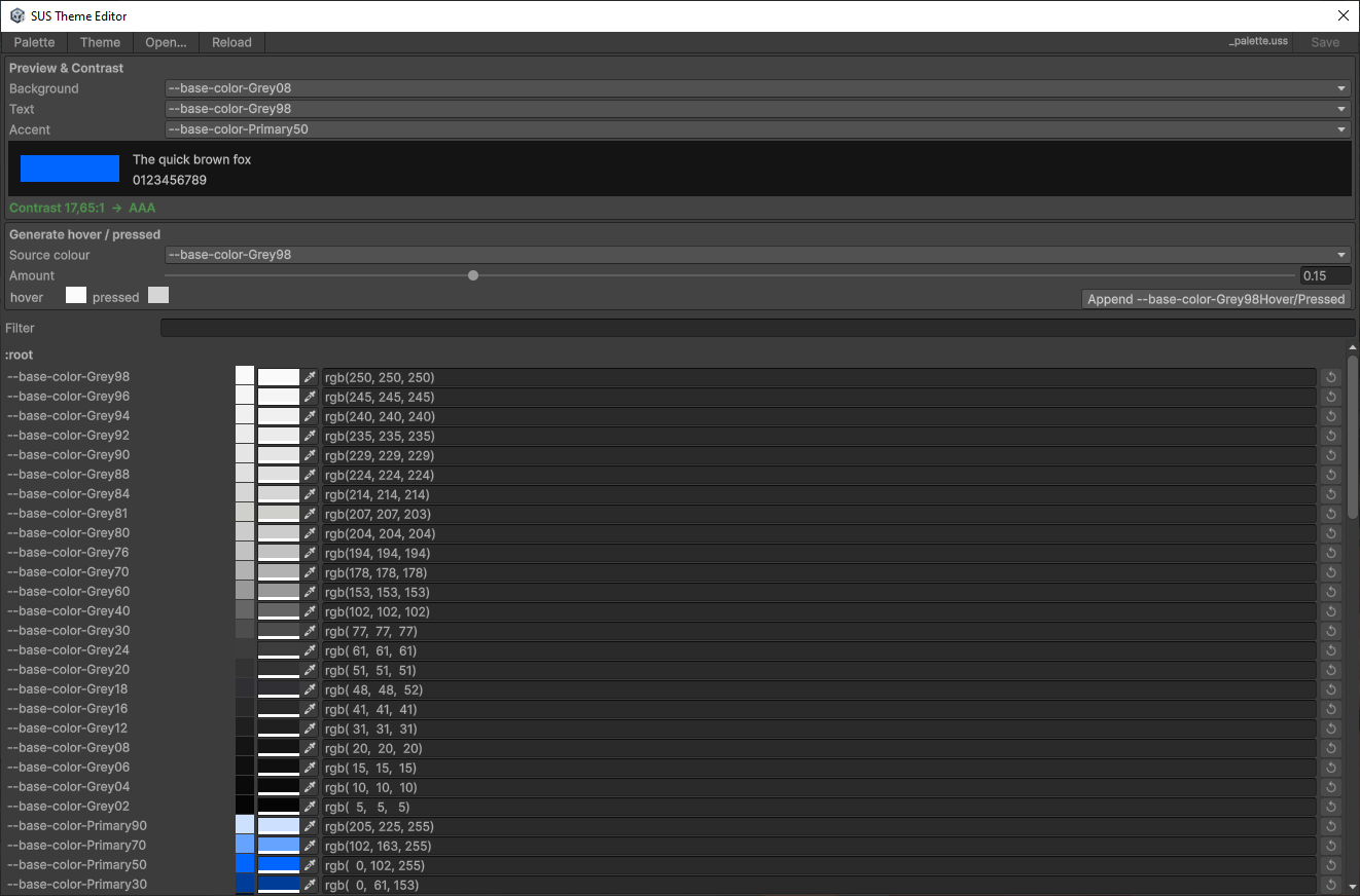
An Editor window for editing _palette.uss visually instead of hand-typing rgb() values: color swatches per token (--base-color-*), a preview strip with a live contrast ratio, and a generator for hover/pressed variants from a source color. Saves back to the project's _palette.uss override.
9. Historical checklist
Phases B–F (palette/theme/L3 tokens, breakpoints, Phosphor icons, SusApp cascade, docs) are done. This buyer page is not a roadmap.
Open font-face work (Thin / ExtraLight / SemiBold / ExtraBold and related _font.uss expansions) is tracked on the internal roadmap and is not part of this package.
| Phase | Outcome | Status |
|---|---|---|
| A — Fonts (shipped subset) | Montserrat 6 styles + semantic font-size tokens + family bridges | ✅ (open faces → internal plan) |
| B — Colors | _palette / _theme / design-tokens + SusThemeService | ✅ |
| C — Dimensions / breakpoints | spacing/radius L1; SusBreakpointService | ✅ |
| D — Icons | Core subset + optional Phosphor sample + registry | ✅ |
| E — Bootstrap | SusApp / LoadTokenCascade | ✅ |
| F — Documentation | this page + package projection | ✅ |
Appendix A: Token Summary Table
Public L3 inventory (61 --sus-*). Source: design-tokens.uss + _font.uss (font-size tokens).
Surfaces / text / border / scrim
| Token | Role | Layer |
|---|---|---|
--sus-bg-page | Page background | Color L3 |
--sus-bg-surface | Card / panel | Color L3 |
--sus-bg-surface-raised | Elevated surface | Color L3 |
--sus-bg-overlay | Overlay surface (--thm-bg-surface-overlay) | Color L3 |
--sus-bg-surface-variant | Variant surface | Color L3 |
--sus-bg-disabled | Disabled fill | Color L3 |
--sus-text-primary | Body text | Color L3 |
--sus-text-secondary | Secondary text | Color L3 |
--sus-text-disabled | Disabled text | Color L3 |
--sus-text-on-primary | Text on filled primary | Color L3 |
--sus-border | Default border | Color L3 |
--sus-border-hover | Hover border | Color L3 |
--sus-border-focus | Focus ring | Color L3 |
--sus-divider | Divider | Color L3 |
--sus-scrim | Modal / overlay dim | Color L3 |
Brand / status / overlays / opacity
| Token | Role | Layer |
|---|---|---|
--sus-primary, --sus-primary-hover, --sus-primary-pressed | Brand | Color L3 |
--sus-secondary, --sus-secondary-hover | Neutral accent | Color L3 |
--sus-success, --sus-success-hover | Success | Color L3 |
--sus-warning, --sus-warning-hover | Warning | Color L3 |
--sus-error, --sus-error-hover | Error | Color L3 |
--sus-info, --sus-info-hover | Info | Color L3 |
--sus-hover-overlay | Hover wash | Color L3 |
--sus-selected-overlay | Selected wash | Color L3 |
--sus-disabled-overlay | Disabled wash | Color L3 |
--sus-opacity-hover, --sus-opacity-focus, --sus-opacity-selected, --sus-opacity-disabled | Numeric opacities | Color L3 |
Fonts
| Token | Role | Layer |
|---|---|---|
--sus-font-body, --sus-font-label, --sus-font-heading, --sus-font-italic | Family bridges (-unity-font) | Font L3 |
--sus-font-size-caption | 10px | Size L3 |
--sus-font-size-small | 12px | Size L3 |
--sus-font-size-body | 14px | Size L3 |
--sus-font-size-subtitle | 16px | Size L3 |
--sus-font-size-heading3 | 20px | Size L3 |
--sus-font-size-heading2 | 24px | Size L3 |
--sus-font-size-heading1 | 32px | Size L3 |
--sus-font-size-hero | 48px | Size L3 |
Spacing / radius
| Token | Role | Layer |
|---|---|---|
--sus-space-0 … --sus-space-64 (0,4,8,12,16,24,32,48,64) | Spacing scale | Size L3 |
--sus-radius-sm … --sus-radius-full (sm,md,lg,xl,full) | Corner radius | Size L3 |
L1 helpers often used next to L3 (not counted in the 61): --font-family-regular, --main-font-family, --base-space-*, --base-radius-*.
Appendix B: Key rules and patterns (identified during the process)
B.1 Statics in USS, dynamics in C#
┌─────────────┬────────────────────────┬──────────────────────────┐
│ Where │ Examples │ Rule │
├─────────────┼────────────────────────┼──────────────────────────┤
│ USS (static)│ background-size, │ Do not change in runtime │
│ │ flex-shrink, │ from props - write in USS │
│             │ margin-left, color,    │                          │
│             │ font-size (layout)     │                          │
├─────────────┼────────────────────────┼──────────────────────────┤
│ C# (dynamics) │ width/height from Size, │ Change from props or │
│ │ tint from TintColor, │ runtime logic - in code │
│             │ backgroundImage        │                          │
│             │ (Resources.Load)       │                          │
└─────────────┴────────────────────────┴──────────────────────────┘
Motivation: The main source of change is props. By changing the props, we only change the dynamic attribute in C#. The statics are in USS and are not spread out in the code. This makes it easier to read and debug.
Example (good):
// C# - only dynamic from props
el.style.width = size;   // sus:uss-impossible continuous value from prop Size
el.style.height = size;  // sus:uss-impossible continuous value from prop Size
el.AddToClassList("icon-row");             // ← statics in USS

/* USS:
.icon-row { flex-direction: row; align-items: center; margin-bottom: 6px; } */
The sus:uss-impossible <reason> comment is not decorative — it is what marks a .style.<X> write as an intentional, audited exception instead of debt. Without it (or on a switch like flexDirection/alignItems below) the same write is the antipattern in the next example.
Example (bad - antipattern):
el.style.flexDirection = FlexDirection.Row;   // ← static in C# (migrate to USS)
el.style.alignItems = Align.Center;
el.style.color = new StyleColor(Color.white);
B.2 Sharq bare <style> — how selectors work
Source (.sharq) Compiled (.uss) Does root match?
─────────────────────────────────────────────────────────────────────
<style> .sus-icon { ✅ YES
    flex-shrink: 0;            flex-shrink: 0;
</style>                   }

<style> .sus-icon .sus-icon { ❌ NO
.sus-icon { flex-shrink: 0;            (.sus-icon inside .sus-icon)
    flex-shrink: 0;        }
}
</style>

<style> .sus-icon .child { ✅ YES (if child is inside)
.child {                        ...                    }
    ...
}
</style>
Rule: if you need to style the ROOT of a component, write the properties directly in <style> without selector. If you need to style child elements, use their classes (without the component prefix).
In special cases (self-target, container-target - see rule sharq-css-scoping.mdc) — move the rule to companion .uss as unscoped.
B.3 backgroundImage re-assert pattern
UI Toolkit Known Issue: VectorImage sometimes doesn't render on the first frame. Proven pattern (from old SizedIcon):
el.style.backgroundImage = new StyleBackground(vec);  // sus:uss-impossible resolved icon asset from data
el.MarkDirtyRepaint();
el.schedule.Execute(() =>
{
    el.style.backgroundImage = new StyleBackground(vec);  // sus:uss-impossible resolved icon asset from data
    el.MarkDirtyRepaint();
}).ExecuteLater(0);
el.schedule.Execute(() =>
{
    el.style.backgroundImage = new StyleBackground(vec);  // sus:uss-impossible resolved icon asset from data
    el.MarkDirtyRepaint();
}).ExecuteLater(16);  // next frame
Reinstalling backgroundImage three times: immediately, after 0 frames, after ~1 frame. This ensures that VectorImage will not be “lost” when the tree is rebuilt.
B.4 SVG Import: tessellationMode
| Parameter | Meaning | Why |
|---|---|---|
svgType | 3 | UI Toolkit Vector Image (not Texture2D) |
tessellationMode | 1 | Antialiased Arc Encoding - smooth edges on arcs |
textureSize | 256 | Enough for icons up to 48px |
sampleCount | 4 | Multisampling for subpixel AA |
Never use tessellationMode: 0 (Basic Triangulation) - Gives pixelated/jagged edges on SVG curves.
B.5 USS loading: prefer SusApp / LoadTokenCascade
// ✅ Correct: SusApp (or LoadTokenCascade) on the document root
SusApp.Create(uiDocument)
    .UseTheme(SusTheme.Dark)
    .Mount<App>();
// Cascade order: _palette → _font → _theme → design-tokens → _icon → extras + OverlayHost
// Panel TSS (_global) via ApplyDefaultTSS / SusDefault.tss

// ✅ Lower-level
SusBootstrap.ApplyDefaultTSS(uiDocument);
SusBootstrap.LoadTokenCascade(uiDocument.rootVisualElement);

// ❌ Incorrect: hand-add only design-tokens without _palette/_theme
root.styleSheets.Add(designTokensSheet);
B.6 Versioning sus-core
For any change to .cs in sus-core:
- Increment the version in
sus-core/package.json(patch version) - Commit with version tag
- Push → cache in Unity Package Manager
- Clear
Library/PackageCache/com.sharq-it.sus.core/in the client - Delete
Packages/packages-lock.json - Refresh Unity → the package will be resolved again
Script (.uss, .svg, .meta) changes do not require a manual cache flush.