
SusUnitCard
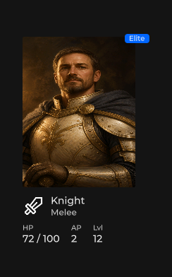
花名册 / 商店单位摘要 — 头像、名称 / 类型、HP · AP · 等级、可选徽章及 actions 插槽。
包
SusGame · 分子(商业)
属性
| 名称 | 类型 | 默认值 | |
|---|---|---|---|
UnitName | Prop<string> | "" | |
UnitType | Prop<string> | "" | |
Image | Prop<string> | "" | |
Icon | Prop<string> | "" | |
ImageSize | Prop<int> | 160 | |
IconSize | Prop<int> | 32 | |
Hp | Prop<int> | 100 | |
MaxHp | Prop<int> | 100 | |
Ap | Prop<int> | 0 | |
Level | Prop<int> | 1 | |
Selected | Prop<bool> | false | |
Disabled | Prop<bool> | false | |
Highlight | Prop<bool> | false | |
BadgeText | Prop<string> | "" |
插槽
| 名称 |
|---|
headerExtra |
bodyExtra |
actions |
事件
| 名称 | 字段 | 载荷 |
|---|---|---|
Clicked | OnClicked | SusUnitCard |
样式钩子
USS 类契约 — 无需改 C# 即可覆盖外观。状态通过这些类切换:
sus-hiddensus-slotsus-unit-cardsus-unit-card__badgesus-unit-card__bodysus-unit-card__body-extrasus-unit-card__footersus-unit-card__headersus-unit-card__header-extrasus-unit-card__header-infosus-unit-card__iconsus-unit-card__imagesus-unit-card__namesus-unit-card__statsus-unit-card__stat-labelsus-unit-card__stat-valuesus-unit-card__subtitlesus-unit-card--disabledsus-unit-card--highlightsus-unit-card--selected
用法
Props 驱动外观;媒体通过 SusGameMedia。点击会触发 OnClicked,除非 Disabled。
csharp
var card = new SusUnitCard();
card.UnitName.Value = "Mara";
card.UnitType.Value = "Sergeant";
card.Image.Value = "portraits/mara";
card.Icon.Value = "";
card.Hp.Value = 42;
card.MaxHp.Value = 50;
card.Ap.Value = 4;
card.Level.Value = 3;
card.Selected.Value = true;
card.BadgeText.Value = "Turn";
card.OnClicked += c => { /* select unit */ };
// Optional: card.RefreshMedia();
xml
<template>
  <sus:SusUnitCard :UnitName="Name.Value"
                   :UnitType="Type.Value"
                   :Image="Img.Value"
                   :Icon="Icon.Value"
                   :IconSize="IcoSize.Value"
                   :Hp="Hp.Value"
                   :MaxHp="MaxHp.Value"
                   :Ap="Ap.Value"
                   :Level="Level.Value"
                   :Selected="Sel.Value"
                   :Disabled="Dis.Value"
                   :Highlight="Hi.Value"
                   :BadgeText="Badge.Value"
                   @clicked="OnClicked">
    <!-- slot actions: e.g. SusButton row -->
  </sus:SusUnitCard>
</template>

<script>
public Prop<string> Name = new("Mara");
public Prop<string> Type = new("Sergeant");
public Prop<string> Img = new("portraits/mara");
public Prop<string> Icon = new("");
public Prop<int> IcoSize = new(32);
public Prop<int> Hp = new(42);
public Prop<int> MaxHp = new(50);
public Prop<int> Ap = new(4);
public Prop<int> Level = new(3);
public Prop<bool> Sel = new(true);
public Prop<bool> Dis = new(false);
public Prop<bool> Hi = new(false);
public Prop<string> Badge = new("Turn");
void OnClicked(SusUnitCard card) { /* … */ }
</script>| Prop / API | 作用 |
|---|---|
UnitName · UnitType | 标题 + 副标题(UnitType → 副标题标签) |
Image · Icon | 头像目录 key / 图标回退(优先使用 Image) |
ImageSize | 已声明(默认 160);头像外观是 USS 3:4 — 绘制不会通过该 prop 被压扁 |
IconSize | 元信息图标尺寸(默认 32) |
Hp · MaxHp | HP 行显示为 Hp / MaxHp |
Ap · Level | 属性行 |
Selected · Disabled · Highlight | BEM 状态类;Disabled 会阻止 OnClicked |
BadgeText | 非空时显示的角标 |
headerExtra slot | 副标题下方你自己的一行(军衔、军衔进度、标签) |
bodyExtra slot | 属性下方你自己的区块(描述、特长) |
actions slot | 底部操作行 |
RefreshMedia() | 延迟绑定后重新应用图片 / 图标 |
OnClicked | 负载 = 该卡片本身 |
插槽:headerExtra 与 bodyExtra
卡片有意不提供军衔或描述 prop。每款游戏对军衔的命名和展示方式各不相同, 因此卡片为这类内容留出两个插槽:
| 插槽 | 宿主类 | 位置 |
|---|---|---|
headerExtra | sus-unit-card__header-extra | 位于 sus-unit-card__header-info 内,紧跟副标题之后 |
bodyExtra | sus-unit-card__body-extra | 紧跟属性行(sus-unit-card__body)之后、页脚之前 |
两个宿主都是没有 padding、margin 和最小尺寸的列。空宿主高度为零,因此 没有插槽内容的卡片保持原有几何尺寸不变。放入内容的间距由你决定。
csharp
var card = new SusUnitCard();
card.UnitName.Value = "Mara";
card.UnitType.Value = "Sergeant";

var rank = new SusChip();
rank.Label.Value = "Captain";
rank.Size.Value = "small";
var rankProgress = new SusProgressLinear();
rankProgress.Value.Value = 65f;
rankProgress.Height.Value = 4f;
card.Slot("headerExtra").Add(rank);
card.Slot("headerExtra").Add(rankProgress);

card.Slot("bodyExtra").Add(new Label("Holds the line while the squad regroups."));
在模板中用 v-slot 填充插槽(参见 插槽):
xml
<sus:SusUnitCard :UnitName="Name.Value" :UnitType="Type.Value">
  <template v-slot:headerExtra>
    <ui:Label text="Captain" class="my-unit-rank" />
  </template>
  <template v-slot:bodyExtra>
    <ui:Label text="Holds the line while the squad regroups." />
  </template>
</sus:SusUnitCard>
如果你的皮肤过去通过代码把徽章移入 sus-unit-card__header-info(例如在 GeometryChangedEvent 上),请改为把它添加到 headerExtra 插槽。
备注
- 与 SusHudUnitCard(战术栏 / 战斗外观)不同。
- 相关的小队卡片:SusSquadCard。