
SusUnitCard
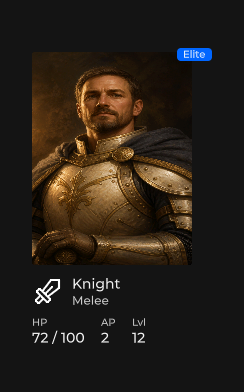
Roster / shop unit summary — portrait, name / type, HP · AP · level, optional badge and actions slot.
Package
SusGame · Molecules (commercial)
Props
| Name | Type | Default | |
|---|---|---|---|
UnitName | Prop<string> | "" | |
UnitType | Prop<string> | "" | |
Image | Prop<string> | "" | |
Icon | Prop<string> | "" | |
ImageSize | Prop<int> | 160 | |
IconSize | Prop<int> | 32 | |
Hp | Prop<int> | 100 | |
MaxHp | Prop<int> | 100 | |
Ap | Prop<int> | 0 | |
Level | Prop<int> | 1 | |
Selected | Prop<bool> | false | |
Disabled | Prop<bool> | false | |
Highlight | Prop<bool> | false | |
BadgeText | Prop<string> | "" |
Slots
| Name |
|---|
headerExtra |
bodyExtra |
actions |
Events
| Name | Field | Payload |
|---|---|---|
Clicked | OnClicked | SusUnitCard |
Style hooks
USS class contract — override appearance without touching C#. States toggle via these classes:
sus-hiddensus-slotsus-unit-cardsus-unit-card__badgesus-unit-card__bodysus-unit-card__body-extrasus-unit-card__footersus-unit-card__headersus-unit-card__header-extrasus-unit-card__header-infosus-unit-card__iconsus-unit-card__imagesus-unit-card__namesus-unit-card__statsus-unit-card__stat-labelsus-unit-card__stat-valuesus-unit-card__subtitlesus-unit-card--disabledsus-unit-card--highlightsus-unit-card--selected
Usage
Props drive chrome; media via SusGameMedia. Click raises OnClicked unless Disabled.
var card = new SusUnitCard();
card.UnitName.Value = "Mara";
card.UnitType.Value = "Sergeant";
card.Image.Value = "portraits/mara";
card.Icon.Value = "";
card.Hp.Value = 42;
card.MaxHp.Value = 50;
card.Ap.Value = 4;
card.Level.Value = 3;
card.Selected.Value = true;
card.BadgeText.Value = "Turn";
card.OnClicked += c => { /* select unit */ };
// Optional: card.RefreshMedia();<template>
<sus:SusUnitCard :UnitName="Name.Value"
:UnitType="Type.Value"
:Image="Img.Value"
:Icon="Icon.Value"
:IconSize="IcoSize.Value"
:Hp="Hp.Value"
:MaxHp="MaxHp.Value"
:Ap="Ap.Value"
:Level="Level.Value"
:Selected="Sel.Value"
:Disabled="Dis.Value"
:Highlight="Hi.Value"
:BadgeText="Badge.Value"
@clicked="OnClicked">
<!-- slot actions: e.g. SusButton row -->
</sus:SusUnitCard>
</template>
<script>
public Prop<string> Name = new("Mara");
public Prop<string> Type = new("Sergeant");
public Prop<string> Img = new("portraits/mara");
public Prop<string> Icon = new("");
public Prop<int> IcoSize = new(32);
public Prop<int> Hp = new(42);
public Prop<int> MaxHp = new(50);
public Prop<int> Ap = new(4);
public Prop<int> Level = new(3);
public Prop<bool> Sel = new(true);
public Prop<bool> Dis = new(false);
public Prop<bool> Hi = new(false);
public Prop<string> Badge = new("Turn");
void OnClicked(SusUnitCard card) { /* … */ }
</script>| Prop / API | Role |
|---|---|
UnitName · UnitType | Title + subtitle (UnitType → subtitle label) |
Image · Icon | Portrait catalog key / icon fallback (Image preferred) |
ImageSize | Declared (default 160); portrait chrome is USS 3:4 — paint does not squash via this prop |
IconSize | Meta icon size (default 32) |
Hp · MaxHp | HP line as Hp / MaxHp |
Ap · Level | Stat row |
Selected · Disabled · Highlight | BEM state classes; Disabled blocks OnClicked |
BadgeText | Corner badge when non-empty |
headerExtra slot | Your own line under the subtitle (rank, rank progress, tag) |
bodyExtra slot | Your own block under the stats (description, perks) |
actions slot | Footer actions row |
RefreshMedia() | Re-apply image/icon after late bind |
OnClicked | Payload = this card |
Slots: headerExtra and bodyExtra
The card has no rank or description props on purpose. Every game names and shows rank differently, so the card leaves two slots for that content:
| Slot | Host class | Position |
|---|---|---|
headerExtra | sus-unit-card__header-extra | Inside sus-unit-card__header-info, right after the subtitle |
bodyExtra | sus-unit-card__body-extra | Right after the stats row (sus-unit-card__body), before the footer |
Both hosts are columns with no padding, margin or minimum size. An empty host has zero height, so a card without slot content keeps its exact geometry. Spacing of what you put inside is up to you.
var card = new SusUnitCard();
card.UnitName.Value = "Mara";
card.UnitType.Value = "Sergeant";

var rank = new SusChip();
rank.Label.Value = "Captain";
rank.Size.Value = "small";
var rankProgress = new SusProgressLinear();
rankProgress.Value.Value = 65f;
rankProgress.Height.Value = 4f;
card.Slot("headerExtra").Add(rank);
card.Slot("headerExtra").Add(rankProgress);

card.Slot("bodyExtra").Add(new Label("Holds the line while the squad regroups."));
In a template, fill a slot with v-slot (see Slots):
<sus:SusUnitCard :UnitName="Name.Value" :UnitType="Type.Value">
  <template v-slot:headerExtra>
    <ui:Label text="Captain" class="my-unit-rank" />
  </template>
  <template v-slot:bodyExtra>
    <ui:Label text="Holds the line while the squad regroups." />
  </template>
</sus:SusUnitCard>
If your skin used to move a badge into sus-unit-card__header-info from code (for example on GeometryChangedEvent), add it to the headerExtra slot instead.
Notes
- Different from SusHudUnitCard (tactical rail / combat chrome).
- Related squad tile: SusSquadCard.