
SusCard
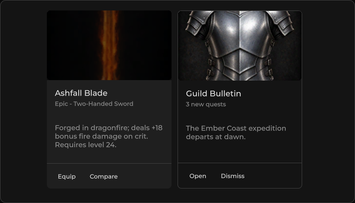
用于组合标题、正文和操作的表面卡片。
包
SusKit · 分子(商业)
属性
| 名称 | 类型 | 默认值 | |
|---|---|---|---|
Variant | Prop<string> | "elevated" | v-model |
Selected | Prop<bool> | false | v-model |
Disabled | Prop<bool> | false | v-model |
Title | Prop<string> | "" | v-model |
Subtitle | Prop<string> | "" | v-model |
Text | Prop<string> | "" | v-model |
Image | Prop<string> | "" | v-model |
ImageHeight | Prop<float> | 0f | v-model |
ImageGradient | Prop<bool> | false | v-model |
Loading | Prop<bool> | false | v-model |
LoadingColor | Prop<string> | "primary" | v-model |
Hover | Prop<bool> | false | v-model |
Link | Prop<bool> | false | v-model |
Rounded | Prop<string> | "md" | v-model |
MinHeight | Prop<float> | 0f | v-model |
MinWidth | Prop<float> | 0f | v-model |
Corners | Prop<bool> | false | v-model |
插槽
| 名称 |
|---|
header |
(默认) |
actions |
footer |
事件
| 名称 | 字段 | 载荷 |
|---|---|---|
Click | OnClick | — |
样式钩子
USS 类契约 — 无需改 C# 即可覆盖外观。状态通过这些类切换:
sus-cardsus-card__actionssus-card__bodysus-card__headersus-card__image-gradientsus-card__image-wrapsus-card__loadersus-card__subtitlesus-card__textsus-card__titlesus-card--disabledsus-card--elevatedsus-card--flatsus-card--hoversus-card--linksus-card--loadingsus-card--outlinedsus-card--rounded-lgsus-card--rounded-pillsus-card--rounded-smsus-card--rounded-xlsus-card--selectedsus-card--tonalsus-hiddensus-slot
用法
xml
<template>
  <sus:SusCard Title="Card title"
               Subtitle="Subtitle"
               Text="Body text for the card."
               Variant="elevated"
               :Selected="Selected.Value"
               :Hover="Hover.Value"
               :Loading="Loading.Value"
               @click="OnClick">
    <template #actions>
      <sus:SusButton Text="Details" Variant="text" />
    </template>
  </sus:SusCard>
</template>

<script>
public Prop<bool> Selected = new(false);
public Prop<bool> Hover = new(false);
public Prop<bool> Loading = new(false);
void OnClick() { /* fires when Link is true */ }
</script>
csharp
var card = new SusCard();
card.Title.Value = "Card title";
card.Subtitle.Value = "Subtitle";
card.Text.Value = "Body text for the card preview.";
card.Variant.Value = "elevated";
card.Rounded.Value = "md";
card.OnClick += () => { /* … */ };
变体
elevated · flat · tonal · outlined
备注
- 插槽:
header、默认正文、actions、footer。 - 设置
Link以启用点击处理(OnClick)。 Image+ImageHeight/ImageGradient会在 header 上方添加一条媒体条。