
SusRating
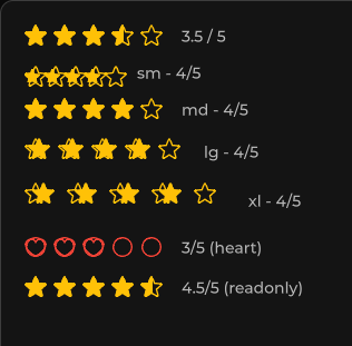
星形(或自定义图标)评分 —— 整数或半数递增。
包
SusKit · 原子(商业)
属性
| 名称 | 类型 | 默认值 | |
|---|---|---|---|
Value | Prop<float> | 0 | v-model |
Max | Prop<int> | 5 | v-model |
Color | Prop<string> | "warning" | v-model |
EmptyIcon | Prop<string> | "star" | v-model |
FullIcon | Prop<string> | "star-fill" | v-model |
HalfIcon | Prop<string> | "" | v-model |
HalfIncrements | Prop<bool> | false | v-model |
Hover | Prop<bool> | false | v-model |
Readonly | Prop<bool> | false | v-model |
Size | Prop<string> | "md" | v-model |
Clearable | Prop<bool> | false | v-model |
插槽
没有插槽。
事件
| 名称 | 字段 | 载荷 |
|---|---|---|
ValueChanged | OnValueChanged | float |
样式钩子
USS 类契约 — 无需改 C# 即可覆盖外观。状态通过这些类切换:
keyboard-focussus-anomaly-oksus-hiddensus-ratingsus-rating__starsus-rating__star-emptysus-rating__star-fill-clipsus-rating__star-fill-clip--emptysus-rating__star-fill-clip--fullsus-rating__star-fill-clip--halfsus-rating__star-fullsus-rating--dangersus-rating--hoversus-rating--infosus-rating--primarysus-rating--readonlysus-rating--secondarysus-rating--size-lgsus-rating--size-smsus-rating--size-xlsus-rating--successsus-rating--warning
用法
xml
<template>
  <sus:SusRating :Value="Score.Value"
                 Max="5"
                 Color="warning"
                 HalfIncrements="true"
                 Hover="true"
                 @value-changed="OnScore" />
</template>

<script>
public Prop<float> Score = new(3.5f);
void OnScore(float value) { /* … */ }
</script>
csharp
var rating = new SusRating();
rating.Value.Value = 4f;
rating.Max.Value = 5;
rating.Color.Value = "warning";
rating.Clearable.Value = true;
rating.OnValueChanged += value => { /* … */ };
备注
- 通过
EmptyIcon/FullIcon/HalfIcon(Phosphor 图标名)覆盖默认图标。 Readonly用于仅展示的分数;Hover会在指针下预览数值。