
SusRating
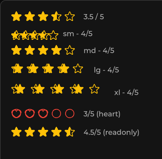
Star (or custom icon) rating — whole or half increments.
Package
SusKit · Atoms (commercial)
Props
| Name | Type | Default | |
|---|---|---|---|
Value | Prop<float> | 0 | v-model |
Max | Prop<int> | 5 | v-model |
Color | Prop<string> | "warning" | v-model |
EmptyIcon | Prop<string> | "star" | v-model |
FullIcon | Prop<string> | "star-fill" | v-model |
HalfIcon | Prop<string> | "" | v-model |
HalfIncrements | Prop<bool> | false | v-model |
Hover | Prop<bool> | false | v-model |
Readonly | Prop<bool> | false | v-model |
Size | Prop<string> | "md" | v-model |
Clearable | Prop<bool> | false | v-model |
Slots
No slots.
Events
| Name | Field | Payload |
|---|---|---|
ValueChanged | OnValueChanged | float |
Style hooks
USS class contract — override appearance without touching C#. States toggle via these classes:
keyboard-focussus-anomaly-oksus-hiddensus-ratingsus-rating__starsus-rating__star-emptysus-rating__star-fill-clipsus-rating__star-fill-clip--emptysus-rating__star-fill-clip--fullsus-rating__star-fill-clip--halfsus-rating__star-fullsus-rating--dangersus-rating--hoversus-rating--infosus-rating--primarysus-rating--readonlysus-rating--secondarysus-rating--size-lgsus-rating--size-smsus-rating--size-xlsus-rating--successsus-rating--warning
Usage
xml
<template>
  <sus:SusRating :Value="Score.Value"
                 Max="5"
                 Color="warning"
                 HalfIncrements="true"
                 Hover="true"
                 @value-changed="OnScore" />
</template>

<script>
public Prop<float> Score = new(3.5f);
void OnScore(float value) { /* … */ }
</script>
csharp
var rating = new SusRating();
rating.Value.Value = 4f;
rating.Max.Value = 5;
rating.Color.Value = "warning";
rating.Clearable.Value = true;
rating.OnValueChanged += value => { /* … */ };
Notes
- Override icons with
EmptyIcon/FullIcon/HalfIcon(Phosphor names). Readonlyfor display-only scores;Hoverpreviews the value under the pointer.