
SusBottomNav
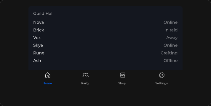
Mobile / console tab strip — icon + label cells driven by Items + Model.
Package
SusKit · Molecules (commercial)
Props
| Name | Type | Default | |
|---|---|---|---|
Items | Prop<List<BottomNavItem>> | [] | v-model |
Model | Prop<string> | "" | v-model |
Grow | Prop<bool> | true | v-model |
Disabled | Prop<bool> | false | v-model |
Color | Prop<string> | "primary" | v-model |
Slots
No slots.
Events
| Name | Field | Payload |
|---|---|---|
Change | OnChange | string |
Style hooks
USS class contract — override appearance without touching C#. States toggle via these classes:
keyboard-focussus-bottom-navsus-bottom-nav__iconsus-bottom-nav__itemsus-bottom-nav__item--activesus-bottom-nav__item--disabledsus-bottom-nav__item--growsus-bottom-nav__labelsus-bottom-nav__rowsus-bottom-nav--disabledsus-bottom-nav--growsus-bottom-nav--primarysus-bottom-nav--secondarysus-bottom-nav--surfacesus-hidden
Usage
Items are set in code (List<BottomNavItem>). Each item carries Label, Value, optional Icon / Disabled.
csharp
var nav = new SusBottomNav();
nav.Items.Value = new List<SusBottomNav.BottomNavItem>
{
    new() { Label = "Home", Value = "home", Icon = "home" },
    new() { Label = "Party", Value = "party", Icon = "users" },
    new() { Label = "Shop", Value = "shop", Icon = "shop" },
    new() { Label = "Settings", Value = "settings", Icon = "settings" },
};
nav.Model.Value = "home";
nav.Grow.Value = true;
nav.Color.Value = "primary";
nav.OnChange += value => { /* … */ };
xml
<template>
  <sus:SusBottomNav :Model="Tab.Value"
                    Color="primary"
                    :Grow="Grow.Value"
                    @change="OnTab" />
</template>

<script>
public Prop<string> Tab = new("home");
public Prop<bool> Grow = new(true);
void OnTab(string value) { Tab.Value = value; }
// Populate Items in code (same pattern as ChipGroup / Tabs).
</script>| Prop | Role |
|---|---|
Items | List<BottomNavItem> — cells to render |
Model | Selected value |
Grow | Stretch cells across the row |
Color | primary · secondary · surface |