
SusTooltip
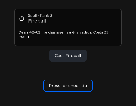
Rich hover card (.sharq). For app-wide hover APIs prefer TooltipService +
Package
SusKit · Overlay (commercial)
Props
| Name | Type | Default | |
|---|---|---|---|
Text | Prop<string> | "" | v-model |
ShowHeader | Prop<bool> | false | v-model |
HeaderIcon | Prop<string> | "" | v-model |
HeaderTitle | Prop<string> | "" | v-model |
HeaderType | Prop<string> | "" | v-model |
ShowBody | Prop<bool> | true | v-model |
ShowDescription | Prop<bool> | true | v-model |
ShowQuote | Prop<bool> | false | v-model |
ShowImage | Prop<bool> | false | v-model |
ShowParams | Prop<bool> | false | v-model |
Description | Prop<string> | "" | v-model |
Quote | Prop<string> | "" | v-model |
ImageSrc | Prop<string> | "" | v-model |
ShowHero | Prop<bool> | false | v-model |
HeroValue | Prop<string> | "" | v-model |
HeroLabel | Prop<string> | "" | v-model |
HeroSlot | Prop<string> | "" | v-model |
ShowBars | Prop<bool> | false | v-model |
Bars | Prop<List<SusTooltipBar>> | [] | v-model |
ShowPerks | Prop<bool> | false | v-model |
Perks | Prop<List<string>> | [] | v-model |
ShowFooter | Prop<bool> | false | v-model |
ShowFooterButtons | Prop<bool> | false | v-model |
FooterText | Prop<string> | "" | v-model |
Disabled | Prop<bool> | false | v-model |
Open | Prop<bool> | false | v-model |
TrackMouse | Prop<bool> | false | v-model |
PreferredSide | Prop<string> | "auto" | v-model |
OpenDelay | Prop<float> | 300f | v-model |
CloseDelay | Prop<float> | 0f | v-model |
TransitionDuration | Prop<float> | 280f | v-model |
Offset | Prop<float> | 12f | v-model |
MaxWidth | Prop<float> | 360f | v-model |
Persistent | Prop<bool> | false | v-model |
Trigger | Prop<string> | "auto" | v-model |
ShowMode | Prop<string> | "popover" | v-model |
Overlay | Prop<bool> | true | v-model |
Params | Prop<List<SusTooltipParam>> | [] | v-model |
_animFrom | Prop<string> | "right" | v-model |
Slots
| Name |
|---|
activator |
Events
| Name | Field | Payload |
|---|---|---|
Close | OnClose | — |
Style hooks
USS class contract — override appearance without touching C#. States toggle via these classes:
sus-hiddensus-imgsus-img--rounded-mdsus-inventory-item__tipsus-tooltipsus-tooltip__barsus-tooltip__bar-labelsus-tooltip__bar-tracksus-tooltip__bar-valuesus-tooltip__barssus-tooltip__bodysus-tooltip__cardsus-tooltip__card--from-bottomsus-tooltip__card--from-leftsus-tooltip__card--from-rightsus-tooltip__card--from-topsus-tooltip__card--inlinesus-tooltip__card--placement-bottomsus-tooltip__card--placement-leftsus-tooltip__card--placement-rightsus-tooltip__card--placement-topsus-tooltip__card--sheetsus-tooltip__card--sheet-inlinesus-tooltip__descriptionsus-tooltip__footersus-tooltip__footer-btnsus-tooltip__footer-buttonssus-tooltip__footer-textsus-tooltip__headersus-tooltip__header-iconsus-tooltip__header-titlesus-tooltip__header-titlessus-tooltip__header-typesus-tooltip__herosus-tooltip__hero-labelsus-tooltip__hero-slotsus-tooltip__hero-valuesus-tooltip__imagesus-tooltip__paramsus-tooltip__param-keysus-tooltip__param-valuesus-tooltip__paramssus-tooltip__perksus-tooltip__perk-dotsus-tooltip__perk-labelsus-tooltip__perkssus-tooltip__quotesus-tooltip__quote-textsus-tooltip--disabledsus-tooltip--inline-placement-bottomsus-tooltip--inline-placement-leftsus-tooltip--inline-placement-rightsus-tooltip--inline-placement-topsus-tooltip--inventorysus-tooltip--opensus-tooltip--popoversus-tooltip--rarity-commonsus-tooltip--rarity-epicsus-tooltip--rarity-exoticsus-tooltip--rarity-legendarysus-tooltip--rarity-raresus-tooltip--rarity-uncommonsus-tooltip--sheet
TooltipService (kit)
Wire once at bootstrap (OverlayHost from SusApp / SusBootstrap):
csharp
var tooltip = new TooltipService();
tooltip.Init(app.Overlay);
tooltip.CreateTooltip = () => new SusTooltip();
TooltipService.Instance = tooltip;
Fluent API
csharp
// Text
button.WithTooltip("Click to save");
icon.WithTooltip("Help", TooltipPlacement.Right);

// Rich entry (CreateCard factory)
spell.WithTooltip(new SusTooltipCardEntry {
    Title = "Fireball",
    Description = "Damage 50–70",
});

// Custom VisualElement card (ShowContent) — any factory
slot.WithTooltip(() => BuildItemCard(item), TooltipPlacement.Right);| API | Role |
|---|---|
ShowAtElement | Text via CreateTooltip |
ShowContent | Custom Func<VisualElement> on OverlayHost Tooltip layer |
ShowRich | SusTooltipCardEntry via CreateCard |
Hide / HideAfterDelay | Dismiss |
Only one service tooltip is active at a time. Placement: Auto / Top / Bottom / Left / Right with edge clamp.
Component usage
Declarative activator + rich card props (teleports to OverlayHost on open):
csharp
var tip = new SusTooltip();
tip.ShowHeader.Value = true;
tip.HeaderTitle.Value = "Fireball";
tip.HeaderType.Value = "Spell";
tip.HeaderIcon.Value = "fire";
tip.ShowBody.Value = true;
tip.ShowDescription.Value = true;
tip.Description.Value = "Deals fire damage in a small area.";
tip.OpenDelay.Value = 200f;
tip.PreferredSide.Value = "auto";
tip.Slot("activator").Add(triggerButton);
xml
<template>
  <sus:SusTooltip :Text="Label.Value"
                  :ShowHeader="ShowHeader.Value"
                  :HeaderTitle="Title.Value"
                  :HeaderType="Type.Value"
                  :HeaderIcon="Icon.Value"
                  :ShowDescription="ShowDesc.Value"
                  :Description="Desc.Value"
                  :PreferredSide="Side.Value"
                  :OpenDelay="Delay.Value"
                  :Open="Open.Value"
                  :Disabled="Disabled.Value">
    <template #activator>
      <sus:SusButton Text="Hover me" />
    </template>
  </sus:SusTooltip>
</template>

<script>
public Prop<string> Label = new("");
public Prop<bool> ShowHeader = new(true);
public Prop<string> Title = new("Fireball");
public Prop<string> Type = new("Spell");
public Prop<string> Icon = new("fire");
public Prop<bool> ShowDesc = new(true);
public Prop<string> Desc = new("Deals fire damage in a small area.");
public Prop<string> Side = new("auto");
public Prop<float> Delay = new(200f);
public Prop<bool> Open = new(false);
public Prop<bool> Disabled = new(false);
</script>
SusTooltip teleports its card to OverlayHost on open (same Tooltip category as the service).
Rarity headers
Inventory / item cards may set sus-tooltip--rarity-*. Colors come from kit tokens --sk-rarity-* (override in consumer theme):
| Class | Token |
|---|---|
…--rarity-common | --sk-rarity-common |
…--rarity-uncommon | --sk-rarity-uncommon |
…--rarity-rare | --sk-rarity-rare |
…--rarity-epic | --sk-rarity-epic |
…--rarity-legendary | --sk-rarity-legendary |
…--rarity-exotic | --sk-rarity-exotic |
Related
- Tooltips guide (synced from sus-kit
02-tooltip.md) - OverlayHost
- SusInventoryItem — game items use
SusTooltipfor hover - Layout recipes — IconRail / Wedge / Parallax / AppBar