
SusRadialMenu
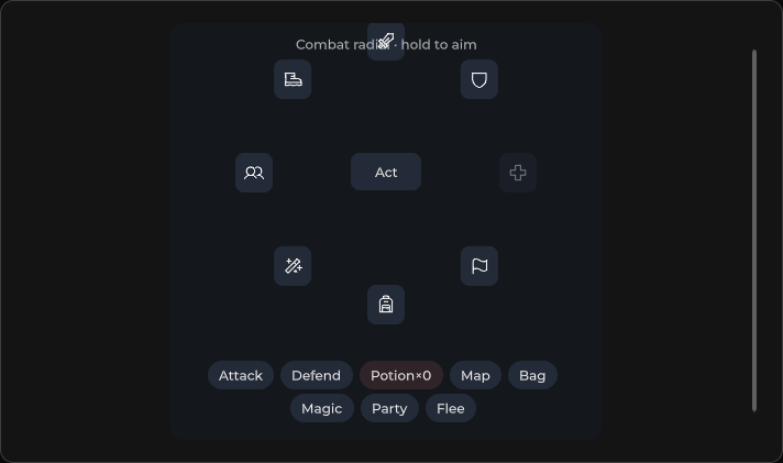
Circular action menu — center activator + items arranged by Radius.
Package
SusKit · Molecules (commercial)
Props
| Name | Type | Default | |
|---|---|---|---|
Items | Prop<List<RadialMenuItem>> | [] | v-model |
Model | Prop<bool> | false | v-model |
Disabled | Prop<bool> | false | v-model |
CenterText | Prop<string> | "+" | v-model |
Radius | Prop<float> | 72f | v-model |
Slots
| Name |
|---|
activator |
Events
| Name | Field | Payload |
|---|---|---|
Select | OnSelect | string |
Open | OnOpen | — |
Close | OnClose | — |
Style hooks
USS class contract — override appearance without touching C#. States toggle via these classes:
keyboard-focussus-hiddensus-radial-menusus-radial-menu__centersus-radial-menu__itemsus-radial-menu__item-tipsus-radial-menu__itemssus-radial-menu--disabledsus-radial-menu--opensus-slot
Usage
Items are set in code (List<RadialMenuItem>). Toggle open with Model or the center activator.
csharp
var radial = new SusRadialMenu();
radial.Items.Value = new List<SusRadialMenu.RadialMenuItem>
{
    new() { Label = "Home", Value = "home", Icon = "home" },
    new() { Label = "Party", Value = "party", Icon = "users" },
    new() { Label = "Shop", Value = "shop", Icon = "shop" },
    new() { Label = "Map", Value = "map", Icon = "map" },
};
radial.CenterText.Value = "+";
radial.Radius.Value = 72f;
radial.Model.Value = true; // open — segments visible
radial.OnSelect += value => { /* … */ };
xml
<template>
  <sus:SusRadialMenu :Model="Open.Value"
                     CenterText="+"
                     :Radius="Radius.Value"
                     :Disabled="Disabled.Value"
                     @select="OnSelect"
                     @open="OnOpen"
                     @close="OnClose" />
</template>

<script>
public Prop<bool> Open = new(false);
public Prop<float> Radius = new(72f);
public Prop<bool> Disabled = new(false);
void OnSelect(string value) { /* … */ }
void OnOpen() { }
void OnClose() { }
// Populate Items in code.
</script>| Prop | Role |
|---|---|
Items | List<RadialMenuItem> — wedge buttons |
Model | Open (true) / closed |
CenterText | Default activator label (slot activator overrides) |
Radius | Distance from center to items |
Disabled | Block open / select |
Notes
- Item fields:
Label,Value,Icon,Disabled. - Selecting an item fires
OnSelectand closes (Model = false). - Custom activator: put content in slot
activatorinstead of relying onCenterText.