
SusDataTable
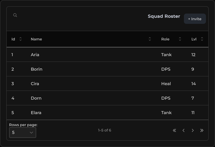
Data grid with toolbar, typed cells, sort / search / pagination — driven by SusTableController.
Package
SusKit · Data (commercial)
Props
| Name | Type | Default | |
|---|---|---|---|
Controller | Prop<SusTableController> | new SusTableController() | v-model |
ShowToolbar | Prop<bool> | true | v-model |
Density | Prop<string> | "default" | v-model |
Variant | Prop<string> | "elevated" | v-model |
Hover | Prop<bool> | true | v-model |
SearchPlaceholder | Prop<string> | "Search..." | v-model |
EmptyText | Prop<string> | "No data available" | v-model |
RowsPerPageLabel | Prop<string> | "Rows per page:" | v-model |
RowsPerPageAutoLabel | Prop<string> | "Rows per page: auto" | v-model |
AllRowsLabel | Prop<string> | "All" | v-model |
Slots
| Name |
|---|
toolbar |
Events
Style hooks
USS class contract — override appearance without touching C#. States toggle via these classes:
keyboard-focussus-data-tablesus-data-table__action-btnsus-data-table__cellsus-data-table__cell--actionssus-data-table__cell--align-centersus-data-table__cell--align-endsus-data-table__cell--descriptionsus-data-table__cell--fixed-widthsus-data-table__cell--selectsus-data-table__cell--togglesus-data-table__cell-wrapsus-data-table__emptysus-data-table__empty-framesus-data-table__empty-textsus-data-table__footersus-data-table__footer-btnsus-data-table__footer-infosus-data-table__footer-leftsus-data-table__footer-rightsus-data-table__footer-selectsus-data-table__header-cellsus-data-table__header-cell--sort-wiredsus-data-table__header-cell--sortablesus-data-table__header-titlesus-data-table__header-title--align-centersus-data-table__header-title--align-endsus-data-table__header-title--sortablesus-data-table__hostsus-data-table__host--fixed-heightsus-data-table__loading-barsus-data-table__loading-overlaysus-data-table__radiosus-data-table__radio--disabledsus-data-table__radio--onsus-data-table__radio-dotsus-data-table__row-markersus-data-table__row-marker--onsus-data-table__row-marker--pulsesus-data-table__searchsus-data-table__skeletonsus-data-table__skeleton-barsus-data-table__skeleton-bar--altsus-data-table__skeleton-rowsus-data-table__sort-btnsus-data-table__sort-btn--activesus-data-table__toolbarsus-data-table__toolbar-actionssus-data-table__viewsus-data-table--density-comfortablesus-data-table--density-compactsus-data-table--hoversus-data-table--variant-flatsus-data-table--variant-outlinedsus-healthbarsus-hiddensus-selectsus-select__detailssus-select__fieldsus-select__valuesus-slotsus-table__action-btnsus-table__cell--boxedsus-table__cell--customsus-table__cell--mediasus-table__cell--numbersus-table__cell--progresssus-table__cell--segmentssus-table__cell--togglesus-table__cell--two-linesus-table__cell-subsus-table__cell-titlesus-table__segmentsus-table__segment--onsus-table__segmentssus-table__segments--fullsus-table__segments-countsus-textfieldunity-collection-view__itemunity-collection-view__item--selectedunity-list-view__itemunity-list-view__item--alternatedunity-list-view__item--selectedunity-multi-column-headerunity-multi-column-header__columnunity-multi-column-header__column__sort-indicatorunity-multi-column-header__column-sortingunity-multi-column-header__column-sorting-indicatorunity-multi-column-view__header-container
Usage
Columns and rows live on the controller (SetColumns / SetItems). Optional ApplyKindDefaults applies a SusTableKind preset.
var ctrl = new SusTableController();
ctrl.ApplyKindDefaults(SusTableKind.MainList);
ctrl.SetColumns(new List<ColumnDef>
{
    new() { Key = "Name", Title = "Name", MinWidth = 140f, Sortable = true, Searchable = true },
    new() { Key = "Role", Title = "Role", Width = 100f, Sortable = true },
    new() { Key = "Level", Title = "Lvl", Width = 72f, Align = "end",
            CellType = SusCellType.Number, Sortable = true },
});
ctrl.SetItems(new List<object>
{
    new Dictionary<string, object> { ["Name"] = "Aria", ["Role"] = "Tank", ["Level"] = 12 },
    new Dictionary<string, object> { ["Name"] = "Borin", ["Role"] = "DPS", ["Level"] = 9 },
});
ctrl.SetItemsPerPage(5);

var table = new SusDataTable();
table.Controller.Value = ctrl;
table.ShowToolbar.Value = true;
table.Density.Value = "default";
table.Variant.Value = "elevated";
table.Hover.Value = true;<template>
<sus:SusDataTable :Controller="TableCtrl.Value"
:ShowToolbar="ShowToolbar.Value"
:Density="Density.Value"
:Variant="Variant.Value"
:Hover="Hover.Value">
<template #toolbar>
<!-- Optional actions next to global search -->
</template>
</sus:SusDataTable>
</template>
<script>
public Prop<SusTableController> TableCtrl = new(new());
public Prop<bool> ShowToolbar = new(true);
public Prop<string> Density = new("default");
public Prop<string> Variant = new("elevated");
public Prop<bool> Hover = new(true);
// Populate TableCtrl columns/items in code (see above).
</script>| Prop | Role |
|---|---|
Controller | SusTableController — columns, items, sort, search, page |
ShowToolbar | Global search + toolbar slot |
Density | default · compact · comfortable |
Variant | elevated · flat · outlined |
Hover | Row hover highlight |
Two-line cells
SusHeaders.TwoLine(key, subKey, title) puts two values in one cell: the key value as the title and the subKey value as a quieter second line under it (SusCellType.TwoLine). Use it for a name with a server, a region or a subtitle next to it.
ctrl.SetColumns(new List<ColumnDef>
{
    SusHeaders.TwoLine("Name", "World", "Player"),
    SusHeaders.Number("Rating"),
});
ctrl.SetItems(new List<object>
{
    new Dictionary<string, object> { ["Name"] = "Aria", ["World"] = "North Reach", ["Rating"] = 1840 },
    new Dictionary<string, object> { ["Name"] = "Borin", ["World"] = "", ["Rating"] = 1712 },
});- Each line is its own label and clips with an ellipsis on its own; neither line wraps, so the cell never grows past the row height.
- Rich text is off on both lines, so markup in your data shows as plain text.
- Sort and global search use the
keyvalue only. - An empty second line gets
sus-hiddenand the title keeps the row alone. - Style hooks:
sus-table__cell--two-line(the cell),sus-table__cell-title,sus-table__cell-sub.
Table tokens
Three tokens size the table chrome. Set them in your skin or theme USS:
| Token | Default | What it controls |
|---|---|---|
--sk-table-header-underlay | transparent | Background behind the header row. Unity's MultiColumnListView paints this area from the Unity theme; the kit overrides it only inside .sus-data-table, so your own MultiColumnListView keeps the theme. |
--sk-table-cell-pad-x | --sk-space-8 | Left and right padding of every cell. Follows the density ladder by default. |
--sk-table-cell-number-pad-x | --sk-table-cell-pad-x | Left and right padding of number cells only. It is added to the cell wrap padding (--sk-table-cell-pad-x, 8 px per side by default), not a replacement for it, so to fit short numbers into a slim column set both tokens. |
.my-skin .sus-data-table {
    --sk-table-header-underlay: rgba(0, 0, 0, 0.35);
    --sk-table-cell-number-pad-x: 2px;
}
Number cells
By default a number cell keeps its natural width. It does not shrink and it never shows an ellipsis: a number wider than its column runs into the cell padding instead of being cut. If your skin prefers an ellipsis, add it on the same selector:
.my-skin .sus-data-table__cell.sus-table__cell--number {
    flex-shrink: 1;
    min-width: 0;
    overflow: hidden;
    white-space: nowrap;
    text-overflow: ellipsis;
}
Skin hooks for common overrides
If your skin used to patch the table by hand, use the built-in hooks instead:
| Custom workaround | Built-in hook |
|---|---|
| A rich-text label with a smaller second line and wrapping turned back on | SusHeaders.TwoLine → sus-table__cell-title / sus-table__cell-sub |
| Repainting the grey strip behind the header | --sk-table-header-underlay |
| Numbers cut to "2…" in a narrow column | --sk-table-cell-number-pad-x (for an ellipsis, see Number cells) |
Notes
- Prefer
SusDataTableoverSusTablewhen you need toolbar, kind presets, or typed cells (SusCellType: text · number · icon · image · toggle · badge · progress · description · two-line · actions). SusTableKind:MainList·Picker·ActionList·ReadOnly·Dev— viaApplyKindDefaults.- Row actions / selection / loading live on the controller (
Options,RowActionRequested,Loading, …). - Empty
Itemsshows the built-in empty state; setLoadingfor the overlay bar. - Known issue: presets that carry a width preset (
SusHeaders.Number,Icon,Image,Active,Actions,Select) ignoreWithWidth(...), becauseWidthTokenwins overWidth. For an exact width, clear the preset:var col = SusHeaders.Number("Rating").WithWidth(60f); col.WidthToken = null;.