
SusHudMenuButton
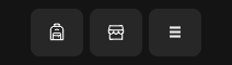
Compact HUD escape / pause entry — tonal secondary button with native tooltip.
Package
SusGame · HUD (commercial)
Props
| Name | Type | Default | |
|---|---|---|---|
Label | Prop<string> | "" | |
Tooltip | Prop<string> | "Menu" | |
ShowInventory | Prop<bool> | false | |
ShowShop | Prop<bool> | false | |
InventoryTooltip | Prop<string> | "Inventory" | |
ShopTooltip | Prop<string> | "Shop" |
Slots
No slots.
Events
| Name | Field | Payload |
|---|---|---|
MenuClicked | OnMenuClicked | — |
InventoryClicked | OnInventoryClicked | — |
ShopClicked | OnShopClicked | — |
Style hooks
USS class contract — override appearance without touching C#. States toggle via these classes:
sus-button--size-smsus-hiddensus-hud-menu-buttonsus-hud-menu-button__btnsus-hud-menu-button__quicksus-hud-menu-button__quick--inventorysus-hud-menu-button__quick--shopsus-hud-menu-button--with-inventorysus-hud-menu-button--with-shop
Usage
csharp
var menu = new SusHudMenuButton();
menu.Label.Value = "☰";
menu.Tooltip.Value = "Menu";
menu.OnMenuClicked += () => { /* open escape / settings */ };
// or: menu.ApplyData("☰");
xml
<template>
  <sus:SusHudMenuButton :Label="Label.Value"
                        :Tooltip="Tip.Value"
                        @menu-clicked="OnMenuClicked" />
</template>

<script>
public Prop<string> Label = new("☰");
public Prop<string> Tip = new("Menu");
void OnMenuClicked() { /* … */ }
</script>| Prop / API | Role |
|---|---|
Label | Button text (default ☰) |
Tooltip | UITK native tooltip (default Menu) |
ApplyData(label?) | Batch label update |
OnMenuClicked | Click |
Notes
- Empty label falls back to
☰. - Place in HUD chrome corner; pair with escape / settings modal flow, not a full menu panel.